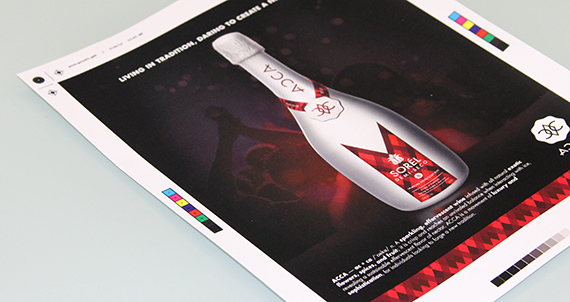
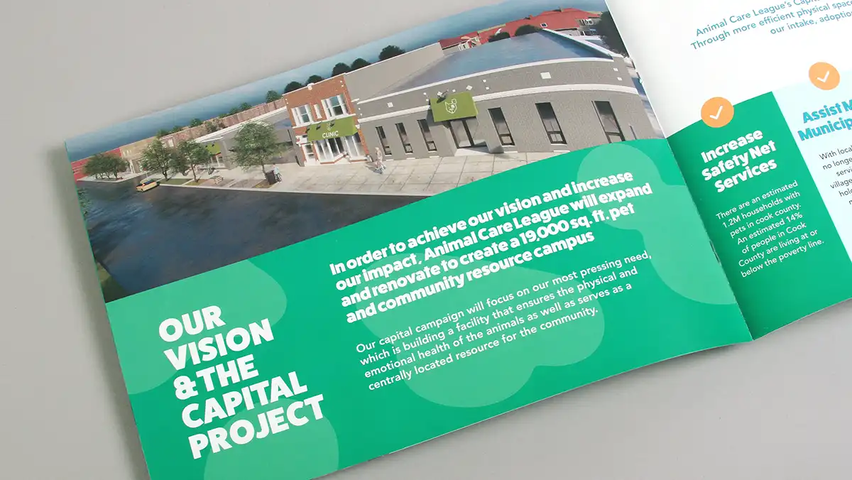
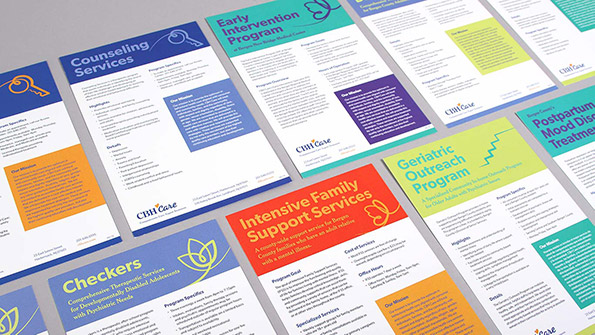
Checking proofs from your graphic designer or printer is an important step that often doesn’t receive the attention it deserves. Even though a graphic designer should be reviewing proofs with a fine-toothed comb, if you are supplying most of the information and assets for the design, it’s always a good idea to spend the time reviewing the proofs closely. Proofs are a preview of how a design will look when printed and will help you verify that the entire job is accurate. Proofs can arrive as black and white or color prints or electronically as a PDF file. Either way, there are important details that should be reviewed each time you receive one.
1. Assure All Content is Included
“Wow! That sell sheet looks amazing!” That is, until you realize that the bulleted list of product benefits is missing. Compare the copy documents you supplied to your graphic designer against the proof to assure everything is accounted for; including text and graphics.
2. Spelling and Punctuation
Read the copy backwards to catch spelling mistakes. When we see words strung together in sentence form our speed reading instincts often take over and we breeze through the copy and miss crucial spelling and punctuation mistakes along the way. There have been times when a misspelled word gets overlooked by several people and it winds up being on the cover of a brochure. Carefully review the spelling and punctuation on your proofs to avoid embarrassing and expensive reprinting costs; and the consequences that may follow. If you’re using Adobe Acrobat to review PDFs, you can perform spell check electronically as a back up to your manual review; but that won’t catch mistakes of improper usage such as using “for” where “four” was supposed to be.
3. Fonts
Fonts can be substituted in the output phase or even erroneously eliminated. Compare an older printout or PDF to the proof to make sure that all of the fonts are in place and intact.
4. Logos and Photos
Sometimes a variety of photos or logos are provided to a graphic designer to select from. If particular logos or a photo of the CEO was supposed to be included, make sure they are present in the proof and any captions that may accompany them are included and accurate. Corporate branding guidelines sometimes dictate which versions of a logo are to be used. It’s a good idea to compare and confirm that the logo is “good to go” as shown on the proof and branding guidelines.
5. Colors
If your brand has an approved color palette, you must make sure that the colors in the proof consistently reflect the specified brand colors. For example, if a particular red is defined by the brand, check the proof throughout to confirm that the correct red is the one being used wherever red is appearing. If you’re unsure, ask your graphic designer or printer to supply a color swatch. There is also a way to check for color consistency and accuracy in PDFs by using Adobe Acrobat but you will need the Pro version of the software to do it.

6. Trim Size
Take out a ruler and measure the proof. It sounds elementary but if you need that insert to fit into a #10 envelope, make sure it will fit before 50,000 of them are printed oversized. If you are reviewing a PDF in Adobe Acrobat, you can hover your cursor over the lower left part of the document window to reveal the trim size.
7. Safe Area
Safe area allows a small margin at the paper’s edge, typically between .125″ and .25″ depending on the final product. For best results, text and other important parts of your design should remain inside the safe area. If critical content does not remain inside the safe area, slight variations during trimming could result in the content being sliced off.
8. Content Positioning
Check alignment of content in the design, especially in documents with multiple pages or variations. Any repeating graphic element should be consistent, such as the positioning of photo captions or alignment of images across a page spread. Use the edge of a blank sheet of paper or ruler to help with this process.
9. Folds
Make sure that any vital information is not obstructed by the folds on your proof. On the other hand, if images or graphics are aligning on the folds, it’s critical to see they are in the right position. Also know that when you have multiple folds in your project (as with a tri-fold brochure), the panels that make up the brochure may not be identical in width or length. When in doubt, ask your graphic designer or print vendor to indicate where the folds appear and have them supply a folded mock-up.
10. The Checker
By the time you reach the proof stage of a project, you may have been looking at the design for weeks or months. This is why we suggest having a fresh set of eyes review the proof before you give your approval. It’s added insurance that nothing gets overlooked.
The bottom line when receiving proofs from your graphic designer is check your proofs carefully. The last thing you want to experience is that pit in your stomach feeling when you receive the cartons of annual reports and discover that (suddenly giant) transposition in the CEO’s letter. Outside of miscues during the printing process, once the proof has been signed for final approval, as the client you are ultimately responsible for the final product.
Hopefully this article will be of some assistance when it comes to reviewing proofs. Anything you can do to eliminate the need for reprinting a project or having to explain how errors were overlooked is a good thing. After all, no one wants to become the person responsible for embarrassing and costly errors.


