Here’s a warning: The color blue can be dangerous for your brand.
Don’t say I didn’t warn you! But what is it about the color blue that could pose a problem for your brand? Especially since so many companies depend on blue as a primary color in their logos and design materials.
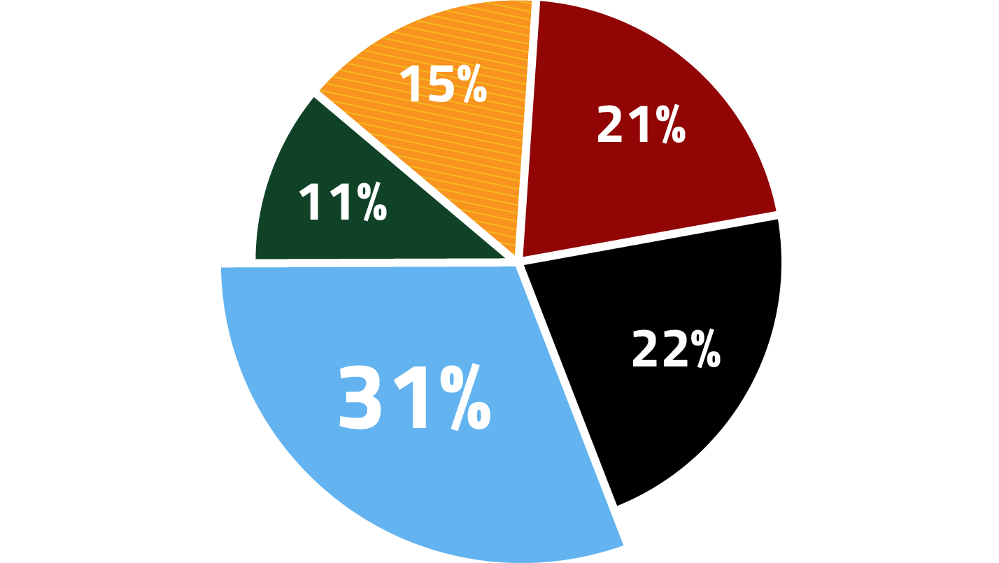
In fact, one-third of the world’s top brands use blue so it would seem like a safe color. But there is so much more to it. The color blue is associated with intuition, imagination, trust, confidence, stability and intelligence. So it’s no wonder many brands and even logos include blue—very specific blues. However, there are some things to be aware of when utilizing blue for your brand so that it can be represented at its best.
Blue can be a great choice but knowing which blue to choose is important.
Utilizing the right color in your brand’s primary color palette is critical. The color will appear on all of your marketing materials including your logo, business cards, advertisements, website, uniforms and more. Blue can be a great choice but knowing which blue to choose is important.
Some blue ink colors don’t dry
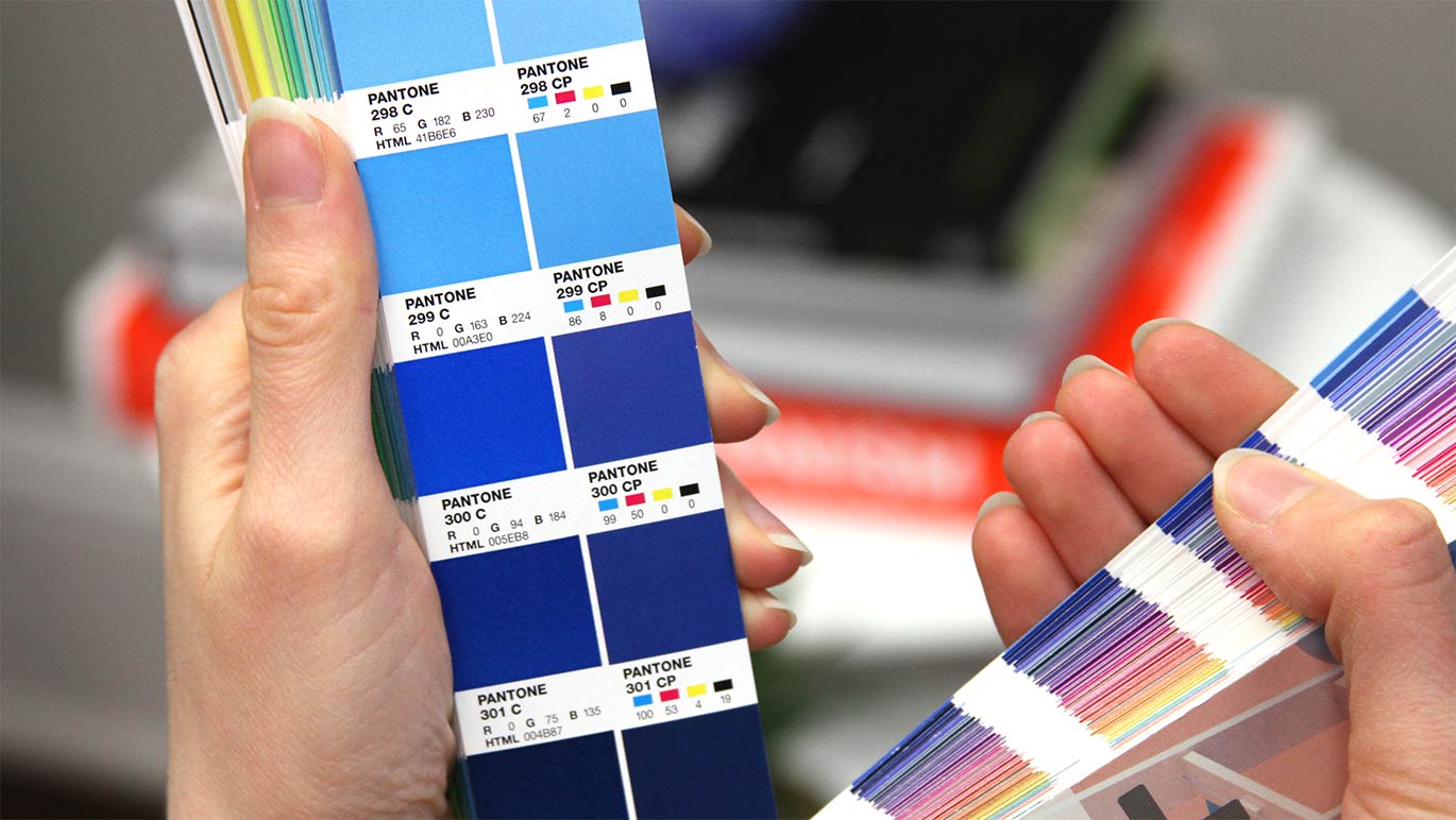
I wanted to start with this fact because it can impact some of your most important branded items. Dark blue colors like the example shown above use lots of reflex blue, and get their rich color from alkali blue pigments which include the mineral cobalt. Reflex blue does not dry due to its porous properties and tends to rub off onto items it comes in contact with—even weeks or months after printing.
For example, if a business card design includes one side that is mostly dark blue and another side that is mostly white, the dark blue side of the card will rub against the white front of the card next to it and discolor it. This creates a scenario called offsetting. Offsetting is when ink is transferred, particularly on uncoated papers, from one item to a neighboring item. In this case, your stack of newly ordered business cards.
Suggesting to your graphic designer that they choose a blue ink that limits the use of reflex blue can help. Also, being mindful of the type of paper being used for certain marketing materials, such as business cards or brochures, can help reduce this discouraging problem. Another way to combat the offsetting problem posed by darker blue colors is to use a clear coating, varnish or lamination on top of the blue ink. The additional top layer protects the ink and can greatly reduce the chance of offsetting.

Lots of other companies use blue in branding
If you and all of your competitors are using blue in their brands, how much will it help you stand out from them? There are many shades, tints and colors of blue to choose from. Depending on your business and your competitive marketplace, however, you may consider a color shift away from blue. I’m not saying to change from blue for the sake of being different, but there are strategic considerations to take into account when deciding on a color palette for your brand. For example, you could have a predominantly blue logo that works beautifully with its complementary color of orange. Utilizing orange as the dominant color for your brand and blue as a secondary color that is used more sparingly.
When choosing or tweaking your brand colors, take a look at what your competitors are doing and make sure you have thoughtful reasoning for choosing your specific blue—or other color—for your brand.
Some blue hues can be problematic
Understanding the make-up of colors is important when recommending them for a brand. Knowing how a specific hue of blue will reproduce in print, on digital screens and websites, as well as clothing and signage is important. We want to select colors that reproduce consistently across different mediums.
The fact is that some blue colors (and others as well) do not convert from one color system to another. In particular, some blue colors that move closer to the violet family, as opposed to the green family, can be a challenge when it comes to reproduction. The reason is that a slight shift in the magenta ink (yes, magenta will be used to print many blue colors) can cause your blue color to appear more like blue-violet.

For example, take a look at the photo above of the Pantone Color Bridge and the swatches labeled 300C and 300CP. The swatch on the left is made of a solid ink color referred to as PMS 300C. The swatch immediately to the right is how the color is recreated with 4-color process printing, also referred to as CMYK. The CMYK color is actually composed of small dots of cyan, magenta, yellow and black ink which overlap to create a color. You’ll see that there is 50% magenta in the color
How to choose the best color for your brand?
At Trillion, it is our responsibility to select colors that represent and reflect a brand’s strategy and can serve as a visual asset to help identify it. The colors we recommend need to be reproduced in so many different ways which makes the color specifications all that more important. If your brand is in need of some assistance or if you have had color consistency issues and need help getting back on track, give us a call at 908.219.4703 or use our simple contact form to reach out to us. We will respond promptly to set up a time to talk.


