Unless you’re a user experience (UX) design professional, you’ve probably never heard of the term “heuristic evaluation.” However, it’s the bread and butter of building, maintaining, and growing any digital application or product. In 1990, Jakob Nielsen and Rolf Molich published an article, “Improving a Human-Computer Dialogue,” which contains the 10 heuristics, or principals, every app should follow for usability.
A heuristic evaluation is the examination of an application based on accepted usability best practices.
If you feel your app is in a rut, or your users are constantly frustrated and keep asking for new features, it might be time to consult a UX designer to see if usability is an issue. At Trillion, our first step is to take the time to understand what the app is supposed to do and how it’s intended to work. Then, we perform usability testing as third-party consultants by interviewing and watching your users interact with your web app. After conducting these interviews, we analyze and diagnose your app’s stumbling blocks:
1. Visibility of System Status

The system should always keep users informed about what is going on, through appropriate feedback within reasonable time.
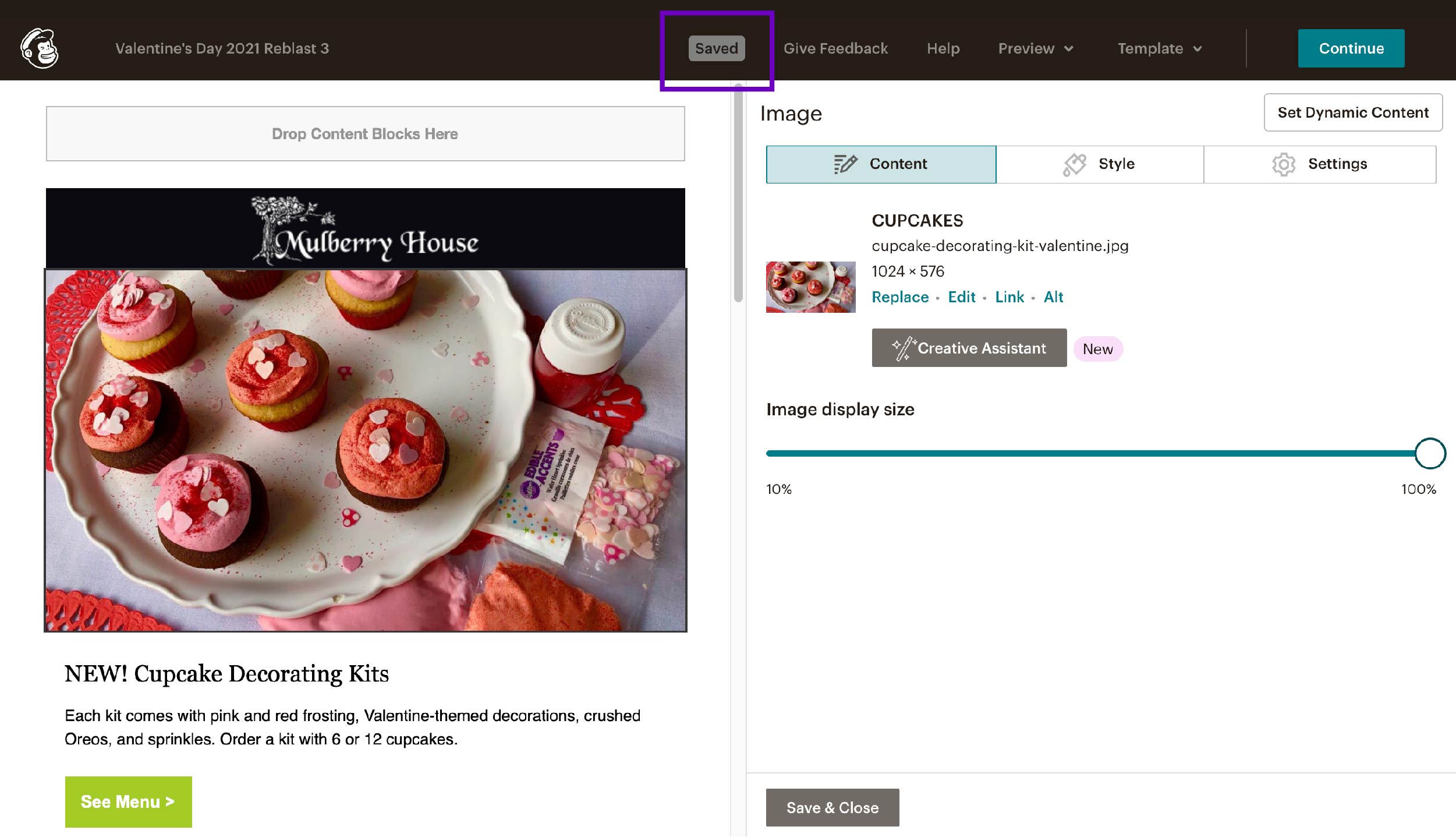
For example, if you are editing an email campaign in MailChimp, you click “save” and the system gives feedback to tell you that your work has been saved. In another app, that lack of feedback could result in user frustration and anxiety especially if they don’t know if their work has been saved.
2. Match Between System and Real World
The system should speak the users’ language, with words, phrases, and concepts familiar to the user, rather than system-oriented terms. Follow real-world conventions, making information appear in a natural and logical order.
This heuristic is a good reminder to clear your app of all system-related jargon and stick to language you know your users will understand. Just because it’s an app doesn’t mean it can be filled with technical language and terminology.
3. Help Users Recognize, Diagnose, and Recover from Errors
Error messages should be expressed in plain language (no codes), precisely indicate the problem, and constructively suggest a solution.
The simplest example of this is when you’re filling out a contact form or some other data input form. The user needs to know if they made any formatting errors when typing in a phone number or email address. Best practice dictates the erroneous input gets called out using a color (usually red) and a message stating clearly what the error was: “Phone numbers need to have ten digits.”
4. Aesthetic and Minimalist Design
Dialogues should not contain information which is irrelevant or rarely needed. Every extra unit of information in a dialogue competes with the relevant units of information and diminishes their relative visibility.
This is where copywriting and prioritization of content comes into play. Your app should be very careful when and how it displays information. For example, when filling out a multi-step form, instructions for each step should be presented one at a time, and not presented as one big lump at the beginning. This ensures that everything on the page communicates a clear purpose and function. No frills needed.
5. User Control and Freedom

Users often choose system functions by mistake and will need a clearly marked “emergency exit” to leave the unwanted state without having to go through an extended dialogue. Support undo and redo.
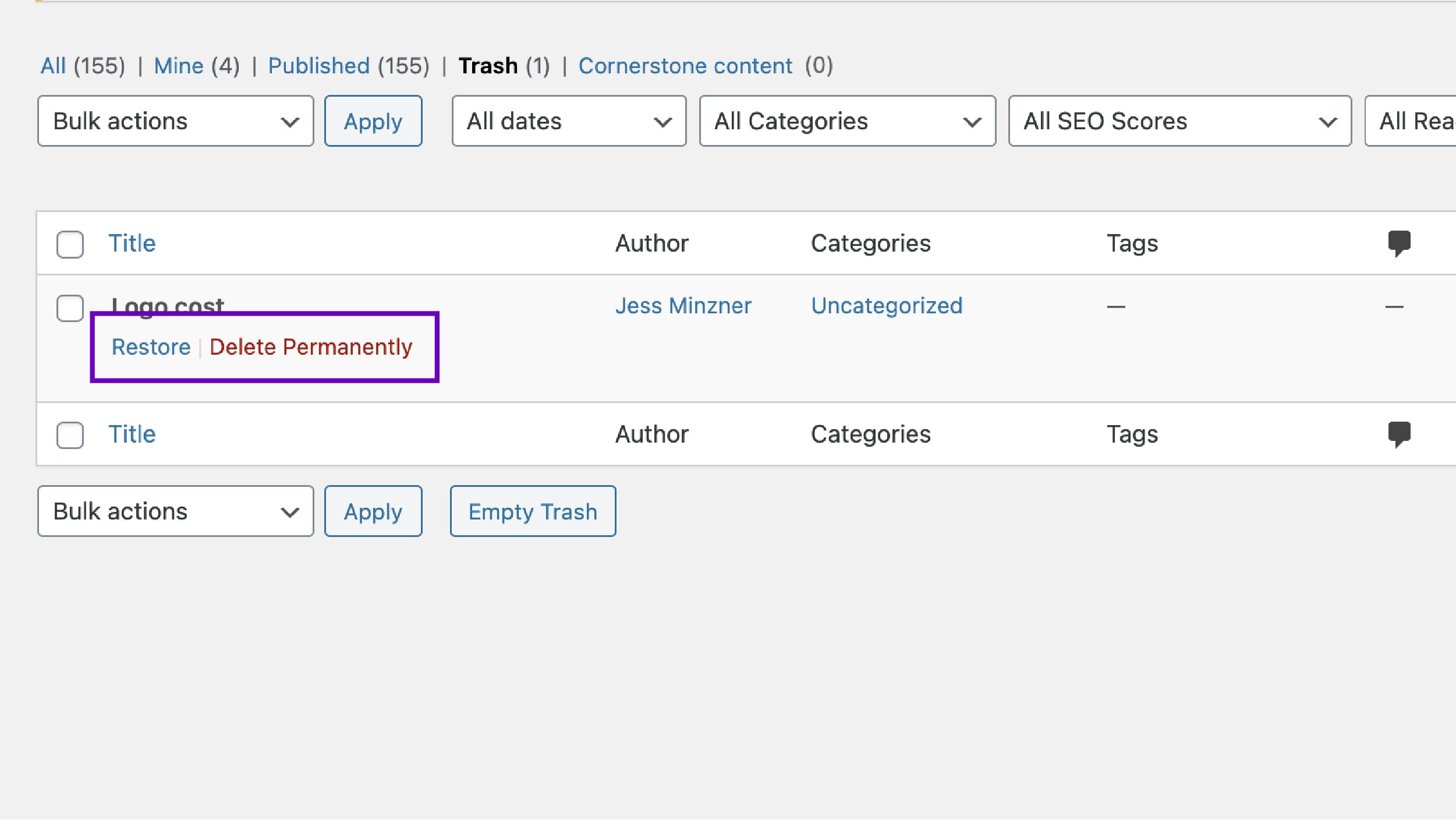
As a casual user of applications, you have definitely encountered a modal asking you “Are you sure you want to delete everything?” and you may have clicked “yes” by accident. As seen in the example above, WordPress allows you to restore posts and pages that were recently deleted. This extra layer of security for the “nuclear option” allows users to recover from potentially costly mistakes.
6. Error Prevention

Even better than good error messages is a careful design which prevents a problem from occurring in the first place. Either eliminate error-prone conditions or check for them and present users with a confirmation option before they commit to the action.
More consequential actions, like deleting a file with important information, should be made harder to perform so they don’t happen by accident. In Apple’s iOS, you need to confirm in the modal that you do in fact want to delete the file.
7. Recognition Rather than Recall
Minimize the user’s memory load by making objects, actions, and options visible. The user should not have to remember information from one part of the dialogue to another. Instructions for use of the system should be visible or easily retrievable whenever appropriate.
Similar to heuristic #4, choosing what messaging and what items are on each page is crucial to a user having a positive experience. In a multi-step form, the directions need to be given at the right time and place so a user can recognize, not recall, what to do, even if they’ve done it ten times before.
8. Consistency and Standards
Users should not have to wonder whether different words, situations, or actions mean the same thing. Follow platform conventions.
A web app is not the place for fancy rhetoric or synonyms to try to make the copy sound less repetitive. Clarity for the user is king, so all terminology and names for pages or actions being consistent is crucial. As an example, you may call something a “User Onboarding Flow” internally, but it’s named “New Patient Form” in-app. If the internal name sneaks into the user-facing part of the app, your users will be very confused.
9. Flexibility and Efficiency of Use
Accelerators – unseen by the novice user – may often speed up the interaction for the expert user such that the system can cater to both inexperienced and experienced users. Allow users to tailor frequent actions.
A new user will often rely on help text and context on the screen. A more experienced user will start looking for shortcuts or ways to accelerate repetitive tasks. Accommodating for both types of users makes your product more valuable.
10. Help and Documentation
Even though it is better if the system can be used without documentation, it may be necessary to provide help and documentation.
Any such information should be easy to search, focused on the user’s task, list concrete steps to be carried out, and not be too large. Any platform that has varied uses and complicated tasks will inevitably need some explanation. Taking the time to document how those tasks can be accomplished will save customer service representatives time so they can focus on actual head-scratching bugs and issues. If these help tools are public (like on a blog), communities can spring up and actually help other users if they have the same issue and even figure out a work-around together.
How a Heuristic Evaluation Can Turn Into Real Results
After UX designers, like those found at Trillion, have performed user interviews, we compile a report listing user feedback. In this stage, it’s important to collect this data without trying to suggest solutions. If many users are experiencing the same issues, it’s a bigger problem than just one user who notices a different issue. Having this solid evidence shows you what problems need to be addressed first.

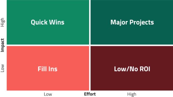
The next step is suggesting solutions to each issue, with the heuristic evaluation as usability benchmarks. At this stage, a prioritization matrix is helpful so your organization can decide what to fix first, how much effort it is to fix it, and how high the reward is for that fix. We always suggest that high impact / low effort solutions be prioritized first, with low impact / low effort solutions next, and high impact / high effort solutions incorporated into your product roadmap. We usually don’t suggest low impact / high effort solutions due to a lack of return on investment.
If your product requires more guidance for how to implement these UX recommendations, we would then make wireframes. Wireframes are like blueprints for your app. They only show where information should be laid out on the page without any design (no colors, fonts, or design elements). The next step would be to introduce visual design into the wireframes.
Let Trillion Guide You Through Usability Testing and a Heuristic Evaluation
Performing usability testing and following through with a heuristic evaluation suggests actionable and insightful solutions to make your app work better for your users. It can alleviate stress (for you and your users), increase productivity, and even contribute to an increased return on your investment. To get started, call 908.219.4703 or fill out our convenient contact form, and one of our usability experts will get in touch with you.


