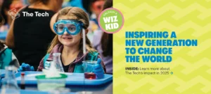
 The Tech Interactive End of Year Appeal
As a not-for-profit, branding is a key component of your success. A good brand instantly conveys the character and intent of your organization, helping you connect with supporters and volunteers, and boosting your chances of success during fundraising and capital campaigns. Your brand is an expression of your mission statement, your organization’s personality, and the audience you are trying to reach.
A strong visual identity starts with strong brand positioning
Your brand’s position is essentially the “why” behind your organization: your reason for being. It is a clear way to express what you stand for. Create a positioning statement that defines why you do what you do and why no other organization does that in exactly the same way. Holding a brand audit can help you with this statement. The statement is internal and will be used to help you focus your external communications. Once clearly defined, the brand position will unite your staff, volunteers and donors under the same message, so that you align your goals and interactions. Only then will you be able to create a visual identity that reflects the true personality of the organization and its mission statement.
Creating the Visual Identity
Most likely you will have professional designers create your visual identity, using their expertise to combine fonts, logos, colors and overall composition. Here is a little more about all of the elements that are needed to create a successful visual identity.
Fonts
It has become common, especially in large organizations, to create a custom font for a brand. When the headline is boldly displayed in any communications, that custom font displays specific personality traits that are a specific reflection of the brand. If you can’t invest in a custom font, look beyond the norm to find an alternative typeface that you could “own” from a visual identity standpoint. Then consider how you use the typeface: you could use all capital letters or no capitalization at all.
Color and Images
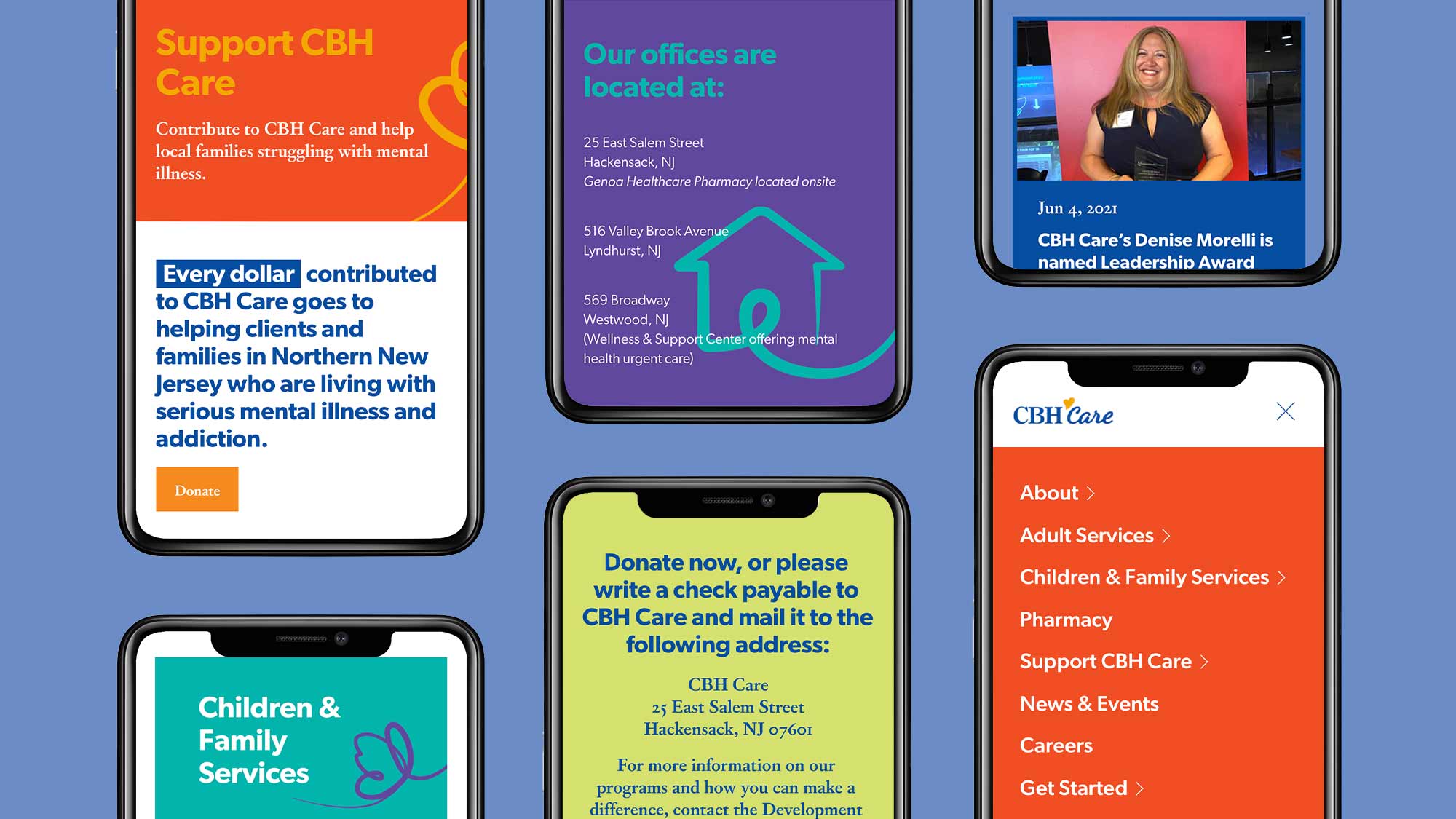
Consistent and bold use of color will also relay a distinct meaning. Think about the character of your organization and let the color evoke that feeling. There is even scientific research that reveals how colors are connected to specific feelings or personality traits so your color decisions aren’t made purely on the leadership’s preferences.
Choose images that express the personality of your brand in a revealing way. Using photos of the community or constituents you serve is a particularly good way to tell your story. Choose the most specific images possible so that your communication materials stand out from the rest. Photos can create a visceral response, make sure they engender the emotions of your brand.
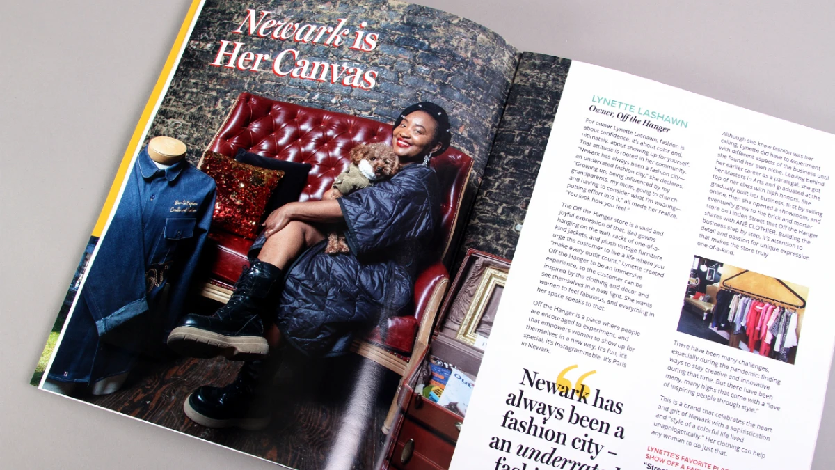
For our client Newark Downtown District, Trillion created their look with strong color palettes of black and yellow and custom fonts. They have maintained this look, incorporating original color photographs of the city and its residents. It all combines to create feelings of civic progress and involvement which reflect directly back to their mission statement.
Keeping Your Brand on Message
Your organization should have a brand guide to help your staff maintain the integrity of the identity. The guide should be accessible to the whole team with the organization’s vision and mission statements explained; it might even have some personality traits or vocabulary listed. When we work with clients on branding, we want the whole team to understand how and why it is important for all materials to mirror those values.
Beware of Diluting the Brand
A not-for-profit may have a professional designer creating and maintaining the visual identity, but there may be smaller tasks for which a staff member needs to produce some branding, which can be challenging. The brand guide can help, but the staff may not have the tools to correctly produce the materials.
In the face of that challenge, it can be tempting to do something slightly different–use a slightly different font or a color that is not the exact match of the brand.
This alteration can also happen when, over time, people get tired of brand guides. Working with the same visual identity day after day, the tendency to want to change is inevitable. So, the integrity of the visual guide struggles to be maintained because people may change a color, add a new color, or use a different pattern, continually tweaking and possibly diluting the visual identity—or the brand’s reputation.
It is natural to want to alter the identity after several months or longer. But there can be a benefit to keeping it the same; what might feel like a long period of time internally, is actually a short period of time externally. Be patient and fight the urge to modify; the reason to have a strong visual identity is to create powerful recognition. An outsider is not seeing those touchpoints daily and needs uniformity to reinforce the brand. Good branding is made to last and brand guidelines shouldn’t be so restrictive that they allow for no new creativity to happen over time.
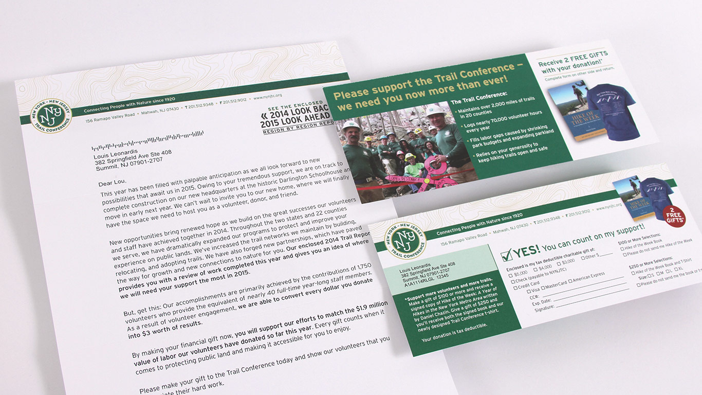
Our client, New York New Jersey Trail Conference, has done a good job of keeping their colors, fonts and logo the same for nearly 20 years and has superb brand recognition.
Applying your visual identity across many platforms
To help your team, set up some standardized templates. Where is the logo placed? Is it always in the upper left corner or on the bottom right? Are your photographs in black and white or vibrantly colored?
As your brand guide is created, ensure the team is familiar with your communication materials. If you are communicating on Instagram, that is a different format than if you are communicating with printed banners or posters. Think about how to retain that personality across your venues: social, email or printed.
Adapting over time
Of course, small changes may be necessary or desirable as time passes, and many organizations find it useful to make subtle changes over time. Striking the right balance between maintaining the identity and changing it is a delicate act best left to professionals. When you decide to adapt the brand, it should be planned out in such a way that you can think about its application moving forward, rather than make a change for a single instance or arbitrary reason.
Having a strong visual identity will pay big dividends for your not-for-profit’s overall marketing strategy. If your organization’s identity needs strengthening or redefining, reach out to Trillion. Our talented team has the vision and artistry to express your brand in distinctive, memorable ways. When many of our clients initially contacted us, they were going through a time of change. Are you too? Give us a call at 908.219.4703 or simply send us a note through our contact form.