Here’s what we’d like you to do: think of one of the most well known brands in the world; one that you see or interact with regularly. Odds are that your thought process included a logo—a mark that represents a company in the simplest form. A logo can resonate with you and immediately connect you to a brand. Considering its amazing power, a brand’s logo is a valuable asset which many businesses may overlook or under value.
The construction of a logo can depend upon the type of logo design you are seeking, have or would like to refine. Following are a few things to consider when deciding if it’s time to design, redesign or refine your company’s logo. We’ll use examples of logos that Trillion has designed as well as other major brands and point out things that you may not have been aware of.
Did you ever wonder if you are losing opportunities for your business based on the quality of your logo design? You may be if your logo is not resonating with your audience or if it is not capturing the essence of your brand. The overall marketing importance of your logo design to your brand is unparalleled and plays a big role in the perception of your brand in its marketplace. If the connections between your logo, your brand and your customers are not seamless, you have a compelling reason to consider a redesign of the logo. Below are some attributes that call attention to the anatomy of a logo design.
Logo Originality
Having an original logo design is an obvious factor in having a valuable logo. Originality comes in many packages but mostly it helps your logo stand out among its competitors as well as other businesses. When you think of iconic brands and logos, they are all very original.
The Idea Behind the Logo
The value of the logo’s idea is extremely important. The way that a logo designer transforms the name of a company into a logo can be pure genius. When done right, it looks effortless and makes sense the instant you look at it. Sometimes, you may look at a great logo and say “Why didn’t I think of that?!” What makes the following logo designs so great is that the symbols represent the names.
![]()
Letterforms
One of our favorite logo design forms is composed of a unique arrangement of the individual letters, or set of original letterforms, which actually create the logo. For example, Coca-Cola, Disney, and Kellogg’s are all hand-drawn letterforms that create the logos and thus make them very unique. For logos like this, particular attention is required to keep the individual letters consistent in some way such as keeping a similar baseline, x-height, angle or down stroke thickness. When there are variables in these things, the logo design starts to become less cohesive. However, some letterform logos can break these rules with elegance and beauty. See the examples below where you will notice that the stokes of the letters are of consistent thicknesses and angles.
![]()
Iconography
Some logos have a wordmark, the letters that spell out the name of the company, as well as an icon. The icon of a logo is a symbol that can be used with or without the wordmark. For well-established brands, the icon may be the only thing that is needed in order for the brand to be recognized. A recent client who came to us to design their logo wanted a small, simple “bug” icon that can be utilized on their products without having the wordmark present. The examples below show popular brands that use iconography for their logo design.
![]()
Logo Legibility
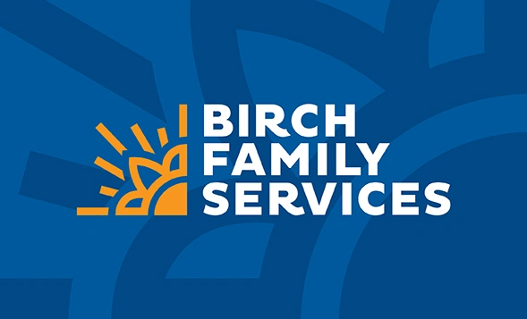
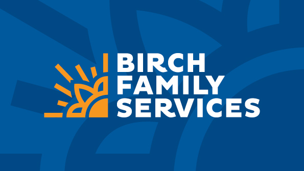
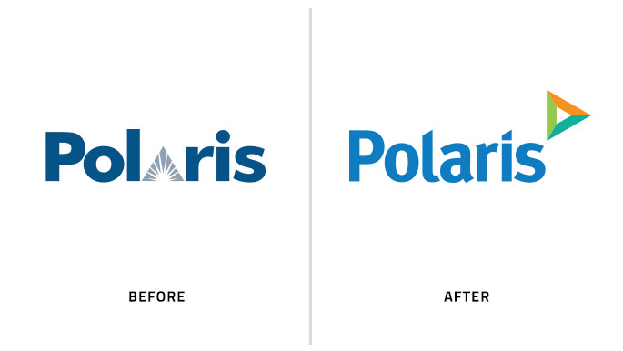
Legibility is so important for 99% of logo designs. The name of the company needs to be read easily in order for consumers to absorb who the business is and how relevant it is to them. For the majority of businesses, the selected font used for a logo should reflect upon the brand’s personality. For Polaris, a healthcare law compliance company, Trillion redesigned their logo to include a modern typeface with a slightly less traditional serif. We also customized the individual letters so they created better spatial relationships with each other and the “star” triangle icon of the mark.
Even though legibility is such an important characteristic to have in a logo design, there are well known examples that are very difficult to read. Somehow Lord & Taylor’s past logo works quite well and is unique within the retail sector even with letters that aren’t entirely legible. Their logo was redesigned in late 2015 and is more legible than the example below which was used by the company for many decades.![]()
Details
Interbrand’s list of the top 100 brands of the world shows that 93% of the logos are simple enough to be viewable in small sizes. So why do we see some brands owning logos with an extensive amount of detail presenting challenges at small sizes or other reproduction methods? In our opinion it is to flaunt the attention to detail; which can be something that’s very important for luxury brands. In some logos, extreme detailing can get lost in small sizes and be impossible to reproduce in embroidery or silkscreening. On the contrary, when produced correctly, the affluence of a detailed logo only reinforces its luxury. See all of the detailing in the following logos that tell a story and relate to their heritage.
![]()
Searching for a logo designer for your business?
At Trillion, it is our passion to design logos and build brand identities. We work hard to discover the unique qualities of a company and represent them through the logo. Our logo designs provide our clients with a brand asset that can be implemented onto all collateral materials without issue and with ease. Logo design is not just design, but an art form. Let us help create your brand’s next logo. Contact us or call 908.219.4703 so we can answer any questions you have regarding the design of your new logo.