This is a short-and-sweet article about some frequently used terms graphic design companies use and are commonly asked to explain. These terms may be used and relate to your next creative project.
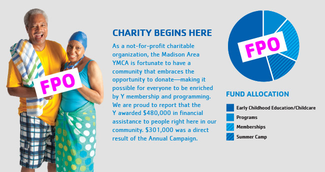
FPO
For Placement Only, “FPO” for short, is a graphic design term regularly used by designers when temporarily inserting a photo or graphic into a design or layout. Large, bold letters “FPO” are often placed prominently over the photo or graphic. It is also shown at an angle as not to be confused with other text in the design. Sometimes an FPO can remind a client that they need to provide the graphic design company with a photo or artwork.
Wireframe
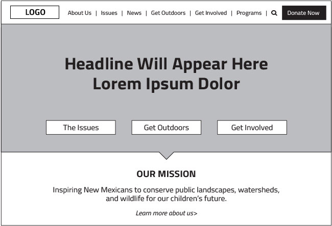
A wireframe is a visual blueprint that represents the skeletal framework of a website. It presents the types of content, not necessarily the exact words or artwork. Wireframes can utilize placeholder text such as “headline will appear here” or a grey rectangular box to represent a photo or image. Wireframes are meant to help plan a website’s content placement and can be quickly edited or adjusted prior to adding complex visual elements and design. Clients can also see the hierarchy of content on a wireframe without photos and design interfering and distracting from it.
Mood Board
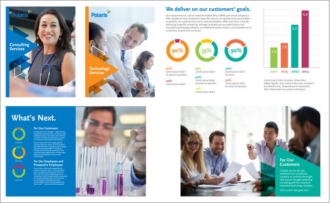
A mood board is an arrangement of images, materials, pieces of text, or other visual elements, intended to evoke or project a particular style or concept. A graphic design company may create a mood board to help present a look and feel of a brand identity or campaign before designing all of the individual components. A mood board quickly provides clients with a comprehensive picture of how an entire suite of materials may look like prior to design and production.
PMS
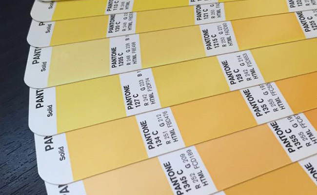
“PMS” stands for Pantone Matching System, a proprietary and standardized color system used in a variety of industries including printing. When printing elements for a brand–especially with one or two solid ink colors–graphic design companies regularly specify solid PMS colors to ensure consistency. These colors are methodically reproduced and utilized by printing companies. So when you hear “PMS color,” know that it is meant to be a very specific ink color for printing. Small ink swatches referred to as PMS color chips show clients exactly what a color will look like.
Comp
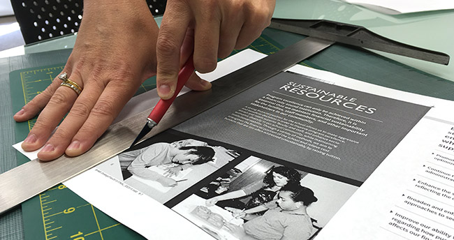
A “comp” is short for comprehensive and commonly refers to a mock-up of a brochure, package design or whatever item your graphic design company is creating for you. A comp is created to help show how a design will be produced, folded, or constructed. A comp should also be shown at full size to ensure all of its content is being produced and positioned correctly. Seeing the size of your text, clarity of images and colors, as well as how the design will be die cut is of the utmost importance with a comp. A comp allows clients to touch and feel a nearly finished piece and to review the construction, size and its relation to other materials.
Armed with these common terms, you’ll be better able to understand what your graphic design company is referring to when they say things such as: “Before we design your website, we need to create the wireframes.” We’ve also written more in-depth articles you may be interested in, including:
- How to Share Constructive Feedback with Your Graphic Designer
- 10 Details to Watch for When Checking Proofs from Your Graphic Designer
- 3 Ways to Measure ROI of Graphic Design and Branding
Coming to Terms with Selecting a New Graphic Design Company
At Trillion we can help you navigate all of the terminology (and methodology!) of creating outstanding graphic design marketing materials for your brand. If your brand is not being represented in its best light, contact us for help. We will conduct a brief consultation with you over the phone so we can begin to understand your challenges, and then suggest a plan of action. Want to get started right now? Give us a call at 908.219.4703.


