 The Tech Interactive End of Year Appeal
Everyone knows how important a strong website design is for any kind of organization. For not-for-profits and their unique marketing goals, web presence becomes more important as online giving takes root with younger—and older—generations. According to Blackbaud Institute’s Giving Trends, online donations recently grew 9% year over year, and 12% of all fundraising came from online sources. Online giving is also growing across all generations; 47% of donors over the age of 60 give online. Your website needs to wow people looking to help your organization—your donations and the health of your foundation depend on it.
For your reading pleasure, we compiled a handy list of the best web design trends that not-for-profit websites will need to compel donors to give. If your site can manage to hit all of these points, you’ll be in great shape for years to come.
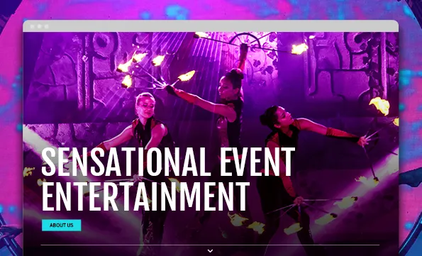
The Best Web Design Trends are Mobile-oriented
Mobile is more important than ever. Some 60% of all internet traffic is on mobile. Many users will never see what your website looks like on a desktop computer.
If you are running a social media marketing campaign, your followers will automatically be directed to your page on their mobile devices, and you want to ensure that your site is ready to welcome them. How often have you left a mobile website because the website took too long to load or the font was too tiny? If the mobile version doesn’t work properly or look great, you will lose potential donors.
Your mobile version should use compelling photography that immediately captures the viewers’ attention and have simple, easy-to-read graphics that will direct a first-time visitor smoothly. Most importantly, there should be a “donate now” button clearly displayed, making it as easy as possible for the ready donor. Or even better, a simple donation form on the landing page.
Not-for-profit Websites Must Be Secure and Encrypted
Website security is perhaps the most important thing a not-for-profit needs to address. Security is an ever-growing issue online. You can tell if a website is safe (encrypted) if it starts with https instead of http. Why should your website be encrypted? Encryption will help prevent intruders from tricking users into giving up information, installing malware, or inserting ads into your site that can harm your site or user experience. Without encryption, your website could be a gateway for a hacker.
Even if your site doesn’t collect any kind of user data like an email address, name or donation, your site should still be encrypted.
Certainly, you want your donors to feel as reassured and safe as possible when they decide to give money or share information. Accordingly, not-for-profit fundraising sites should be using a PCI compliant payment processing tool to collect donations. A good third-party donation collection service with end-to-end encryption will protect your donors, and it will protect you from any liability issues. If your website is not encrypted or mobile-friendly, it is a tell-tale sign that your organization’s website is out of date, which could definitely cause you to lose potential donors.
Encryption and mobile-friendly websites aren’t really trends, they’re must-haves.
The Best Website Designs Keep Content Well-organized
Not-for-profits often have different constituent audiences and a variety of information that needs to be communicated on a website, and the average reader’s attention span lasts a limited amount of time. You don’t necessarily have to cut down on the amount of information if you organize it extremely well and present it in an engaging way.
For example, theaters may have patrons looking to purchase tickets, actors looking for jobs, parents searching for educational programs for their children, and people looking to see how they can volunteer or support them. Schools or universities will have prospective families scouting information, fans checking the athletics pages, students looking for class schedules, and alumni seeking news about their alma mater. Almost all not-for-profits post or link to their annual reports somewhere on their website. An organized website design speaks to different people in the right places and encourages them to stay, learn more, and become a supporter.
A truly effective website will communicate your story in an organized manner so that people can quickly understand who you are and why their gift would be so meaningful.
Once your donor is ready to give, you don’t want to delay the process. Make sure you have multiple calls to action throughout your site with easy-to-click access through which to contribute. Making your donation forms as simple as possible can also help. Between three to five inputs (name, email, etc.) with a secure, third-party payment collection incorporated is a good method to keep things running smoothly. If the donor feels the form takes too long or asks for too much information, they may get turned off and stop the process.
Skimmable Website Content
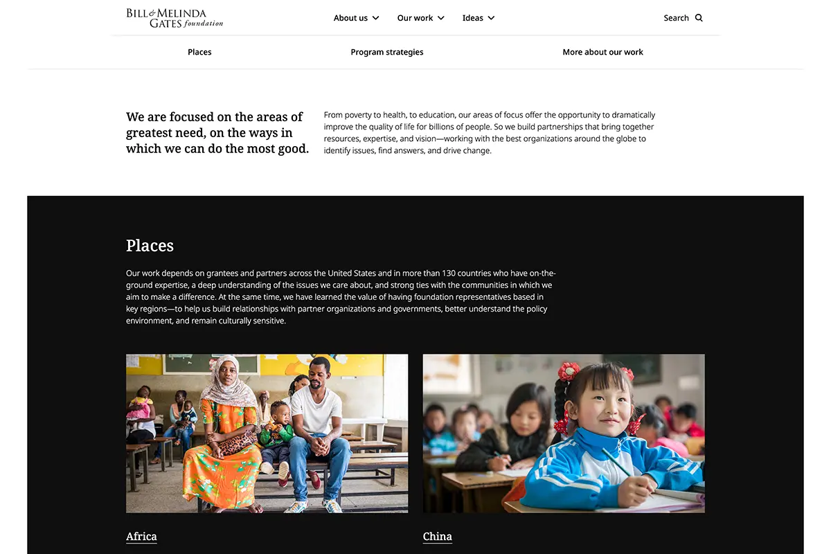
It’s not enough to organize your content well. You need to write it so that a user can skim the headlines and subheads and understand the majority of the content. The in-depth details should come from the supporting paragraphs.
The Gates Foundation has a lot of initiatives; its homepage does an excellent job of summarizing each initiative and providing additional links to dive deeper into each area. This is very effective because you can understand the entirety of the Gates Foundation in a matter of minutes without having to hunt through 20 different pages. The faster the user can understand your foundation, the faster they can get involved.
Website Designers Know How to Show Your Story
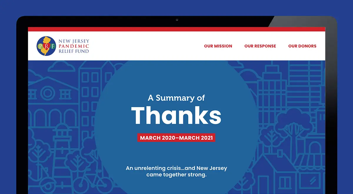
Another way to manage a hefty amount of content is to break it into distinct chapters, and you can do this with a linear web page. The New Jersey Pandemic Relief Fund did just this by writing and designing pages that behave like chapters in a story. When you read one page, there’s another page following it that continues and builds the narrative.
Trillion designed the site so that if you start at “Our Mission,” each successive page (“Our Response,” “Our Donors”) continues the story. Engaging the user with your content is easier if you write your copy so that it compels readers to continue along with your narrative.
Not-for-profit Fundraising with Video Storytelling
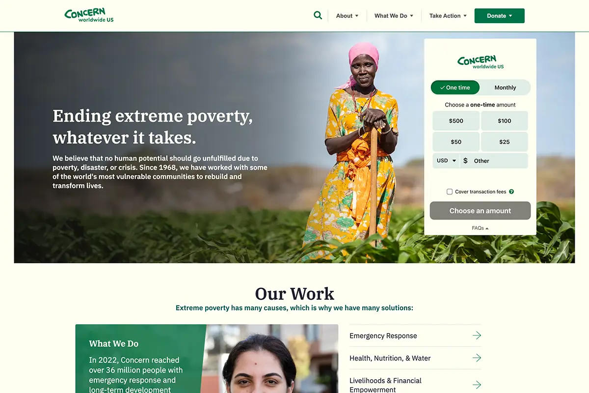
Among the most compelling ways to tell your story is with video. Concern uses several video clips to great effect on its homepage. The beautiful camera work and compelling images invite a level of engagement immediately because a user doesn’t have to watch a minute-long video to get a good idea of what the foundation looks and feels like in action. There’s something very beautiful about the videos as well; they call attention to fine details with movement and add a layer of emotion that static photos don’t have.
You can also use video storytelling as part of an interactive annual report or as part of a capital campaign. Annual reports are a valuable tool for not-for-profit fundraising; they can go into detail about the needs and successes of your organization and deepen the relationship with the audience.
The Best Website Designers Incorporate Microinteractions
A microinteraction is a small animation: a moving loading icon, a unique hover style on a button, or content arranging itself as you scroll through a site. Microinteractions are part of the small details that make a website either great or kind of boring and homogenous. With the popularity of website-building platforms, a lot of websites can wind up looking very similar. A creative way to separate your website from its dull counterparts is through microinteractions.
Adopt a Love Story does a nice job of adding animations to its website in a subtle way. The site utilizes scroll-based interactions. Each time you scroll you get taken to a new page with clear and concise information. The microinteractions bring a level of richness to the site as well as an added layer of branding. Unique hover styles and the ways a user interacts with the site enhance the overall experience a user has with a brand.
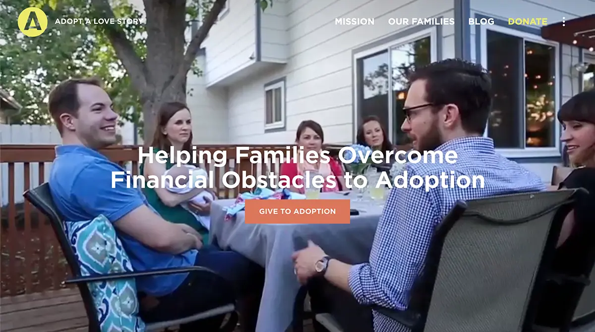
In order to be truly meaningful, the animations should specifically relate to the organization and be a thoughtful expression of their brands. They should animate some actions that are relevant: clean water filling a cup, for instance, that give a visual cue to the viewer.
Website Design That is Easy To Read
Websites are considered “places of public accommodation,” and as such, need to be accessible to all users. Your website must be accessible to all to be Americans with Disabilities Act (ADA)-compliant. Make sure your typeface is easily legible for all viewers. The font should be easy to read and have high contrast between text and background. If the reader has to squint or take an extra few seconds to focus, you are discouraging them from browsing. For full accessibility, there are many excellent screen reader plugins that can be used on your website with features that will allow users to make adjustments for readability.
Typography can be the element that adds character and interest to your design. Along with illustrations and a limited color palette, the Gold Hirsch Foundation successfully uses typography to create a visually interesting, informative, and extremely easy-to-read website.
Landing Pages Can Streamline Donations
One of the best web design trends includes creating a landing page for a specific campaign. If a potential donor has been following a certain story on social media and decides to learn more, they will be directed straight to the landing page that continues that particular story, complete with a handy donation form. If you are specifically promoting relief efforts for fire victims in California, you do not want your donor’s attention diluted by going to your homepage and having to navigate through other stories, a mission statement, etc. Having a specific landing page set up to receive them while they are already mentally engaged can more readily facilitate their donation.
We Can Recommend the Best Web Design Trends For Your Organization
If you feel your website could benefit from an updated design and want to work with an award-winning website design company, consider Trillion. Check out our portfolio to see all of the different not-for-profit projects we’ve worked on, you can also download our free website redesign checklist to begin your website planning. If you like what you see, fill out our contact form or give us a call at 908.219.4703.