Maintaining the integrity of your brand is essential for long-term success. However, Trillion frequently encounters third-party logo design files that didn’t see the highest level of care when they were created. The logos in question come to us in the form of sponsor logos, affiliation logos, and even certification or award logos.
The issues below happen often enough that we think it’s important to offer guidance so you can avoid these pitfalls. With the help of a graphic designer, these logo issues below can be addressed and fixed should you ever notice them in your own logo.
1. Bad Lines in the Logo
When letters and design elements within a logo are drawn or modified, extreme care should be taken by the graphic designer. The lines and points within a logo should be smooth and transition cleanly throughout. In the logo design example below, you will see how a line within a letter does not have a nice curve to it. This is one of the most common issues we see in poorly created logos.
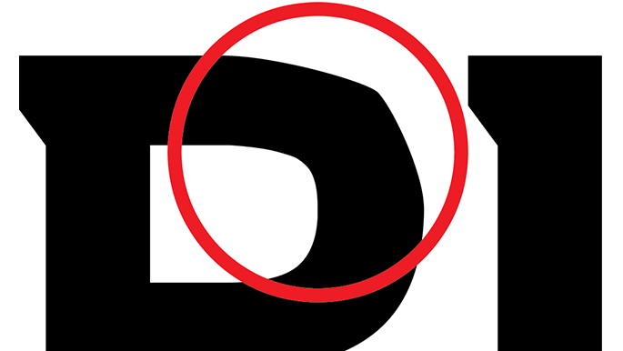
Logo files are composed of many points and lines. When a logo is small, these imperfections might not be noticeable, but as the logo is enlarged the issue becomes more apparent and problematic. You should have a graphic designer fix the curves and lines of the logo. Then use the new files to replace the problematic logo.
2. Improper Alignment of Logo Elements
As a graphic designer is creating a logo, they are composing letters and design elements. They have full control over the sizing and alignment of things. With all of this control, and especially as the number of elements or letters increase, comes the possibility that something does not align as it should.
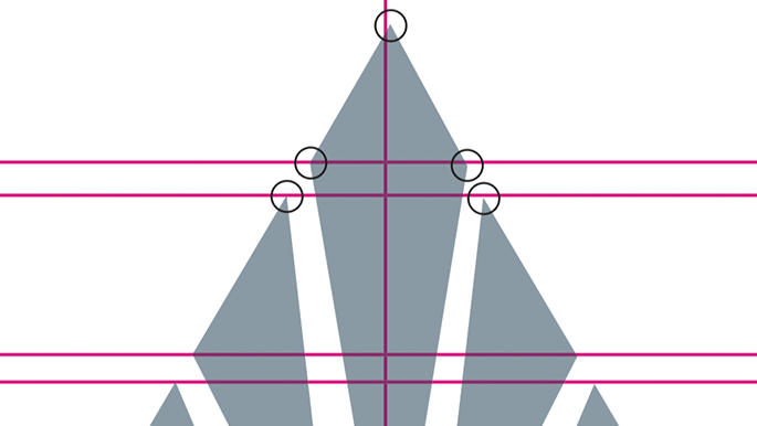
Like the “bad lines” example above, smaller logo sizes may hide the issues when compared to an enlarged version. But on a screen or in digital usage, a misaligned piece of your logo can cause it to look blurry (due to pixel interpolation, having solid dark pixels divided into multiple lighter pixels). A graphic designer can fix the alignment of elements by using a snap-to-grid or snap-to-guide feature, functions available in Adobe Creative Cloud software. This process will ensure that things align as they should in your logo.
3. Missing Font in Logo
A logo design should always be presented as a piece of artwork composed of lines and points or pixels. Unfortunately this is not always the case. If a graphic designer used a particular font in your logo, you may not have that font on your, or your vendor’s, computer. A missing font often leads to it being substituted by another font available on the computer. It’s a major problem that prevents anyone who doesn’t have the font to see the logo properly. This even holds true for a graphic designer trying to fix the problem.
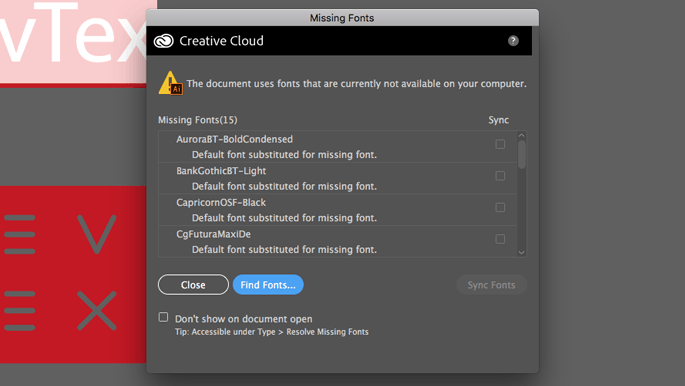
As a logo is designed, fonts are commonly used either as they are, or as a starting point to be modified for the design. The important step in the logo design process is to “outline” the letters being used in the logo so they become a piece of artwork rather than letters you can edit by typing. Once this process has been done, it is not reversible and the font will no longer be required to view and reproduce the logo. Be aware that fonts can cost between $20 and $150 or more just for one weight, such as Helvetica Neue Bold.
4. The Incorrect Logo File Format
Another one of the most common issues we see with logos that are supplied to us is that they are not in the correct file format. If your graphic designer comes to you and says “it’s not the right format” it can mean a few things. However, if your designer intends on using the logo, it is not going to work.
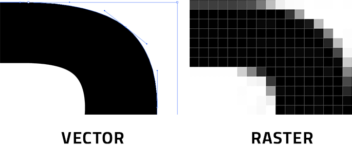
The most common incorrect file format we receive is a raster logo such as a .jpg rather than a vector logo, such as an .eps. (Read “What’s the Difference Between a Vector Logo and a Raster Logo”). A .jpg logo might be fine if the resolution is high enough and it does not require being produced on a color or transparent background. Vector logos will offer a graphic designer the most options, including saving the artwork to other file formats. A vector logo can be enlarged or reduced infinitely without losing quality.
5. The Incorrect Logo Color Format
A less common but potentially more challenging logo file format issue is the color mode. A logo that is being printed on paper, on a t-shirt, or being included on a website will have different color spectrum requirements. (Read “Hey Lou, What’s the Difference Between CMYK and RGB?”) Some can be easily converted from one to another but others cannot. Again, a vector logo will offer a graphic designer the best chance to fix the issue.
Logo Design Done Right
Providing our clients with logo designs and all of the necessary file formats they might need is an important part of our creative process. Once our design has been approved, we create full-color, 1-color, 2-color, black, and white (knockout) versions of the logo for both print and digital usage. We clearly label the files and place them into properly named folders, making it easy to find the right logo. If you have questions about improving your logo design, give us a call at 908.219.4703 or use our simple contact form to tell us what you are looking to accomplish.


