The key ingredient to an efficient and beautiful designer/client relationship is the feedback cycle. It’s often what separates good working relationships from great ones. Designers have written countless articles on how we like our clients to discuss and provide feedback to us. Heck, we’ve even written an article about that!
In this article, I will discuss the top formats you can use for feedback on your latest project with your graphic designer or creative agency. Believe me, we’ve seen it all, and there are pros and cons for each method. Ultimately, you should send feedback in the format that’s easiest for you to provide. However, it’s good to know that there are many methods at your disposal to provide feedback efficiently.
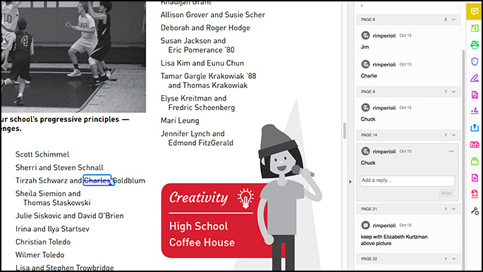
Digitally Annotated PDFs
If you have the latest Adobe Acrobat, our preferred method for most feedback is at your fingertips.
Pros:
- It’s digital. We send you a digital PDF, so instead of printing it out, writing on it, scanning it, and emailing it back, it stays in its original format.
- It has lots of text annotation options! You can click anywhere on the PDF to add a note or add text in the middle of a sentence. Crossing out text or highlighting words to be replaced are among the many annotating options available in Acrobat. Say ‘good-bye’ to describing changes such as, “on page 3, third paragraph in the middle column….”.
- We can copy and paste. As humans with flaws, designers are more than capable of retyping copy changes with errors! We like being able to copy and paste text to make sure we’re not contributing any unwanted changes.

Cons:
- Requires Adobe Acrobat Reader DC (free) or Acrobat Pro. Not everyone has access to Adobe Acrobat or a similar PDF annotation software, but it’s easy to download or subscribe to the software.
The verdict: A digitally annotated PDF is our preferred way to receive feedback, especially for long format pieces such as brochures or annual reports in which revisions and comments can become time consuming.
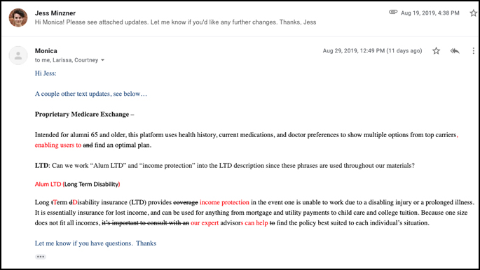
Feedback via Email
Ninety-percent of our communications occur through email. We usually send PDFs, JPGs, or PNGs of designs to our clients. In some cases, we’ll send an InVision link for web design projects. Many clients will just send an email detailing the changes they’d like to see.
Pros:
- We can copy and paste any content changes. Yes, this is important to us. It helps reduce potential oversights.
- Simplest for small revisions. Some revisions are as easy as swapping out a word or deleting/adding a sentence. As long as your email is clear in what should change, a short and sweet email does the trick.
- It’s quick! Typing out an email is fast and most comfortable for nearly all of our clients.
- There’s a record of the conversation. If you’re like us, we talk to a lot of people about a lot of things every day. It helps to be able to refer to past emails.

Cons:
- More detailed revisions become confusing. If the revisions being requested are hard to describe with words alone, this is not the best format.
- Long-format pieces get messy. If changes involve moving content around or adding/subtracting anything from a long format piece, it gets complicated to detail what should be changed on what page/paragraph/sentence/word.
The verdict: Email feedback is best for simple, easy to describe edits.
Annotated and Scanned PDFs/Phone Pictures
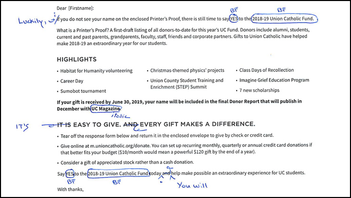
Some of our clients find it easiest to print out our designs, handwrite feedback, scan, and email back to us. We even have some clients who like to handwrite notes, and email us a smartphone picture of them.
Pros:
- It’s tactile. I’m with you, sometimes it’s easiest to implement revisions analog and jot down your thoughts, scribble some arrows, and cross things out.
- It’s good for line editing. Sometimes you need to add in some commas, or swap paragraph order. Having arrows and things circled can be a great way to communicate that.
- When paired with an email, it can be powerful. One of our more organized clients has sent us a manually annotated and scanned PDF with letters indicating changes that correspond to an attached Word document with replacement content. This is a great way to supplement feedback that’s hard to verbally describe.

Cons:
- We may not be able to read your handwriting. Illegible penmanship on a bad printout, or poor scan can make edits hard to implement.
- No spell check. If you spell something wrong, it may not be identified, causing additional rounds of revisions and lost time.
- Will have to re-type any text you write. This is time consuming and can introduce additional billable time for revisions.
- Contrast issues. Poor contrast makes it difficult to read annotations. If you print out something with a dark, solid background and try to write on top of it, we won’t be able to read it. We’ve also had clients annotate in a red or blue pen, but scan in black and white, making it hard to read.
The verdict: Scanned annotations and photos are best for pointing out visual changes and small line edits.
Wait, what about phone calls to discuss feedback?
I thought you’d never ask. Sometimes a quick conversation AFTER we’ve received feedback via any of the methods above can help us clarify all the revisions that need to be implemented. They are also the best way to start a project and talk about big picture strategy.
What method of providing feedback do you prefer?
Our clients are truly our partners when we work on projects together. Part of that relationship is developing the most efficient workflow. If you are searching for a creative team who loves process to help with your next project, just use our simple form on this page or give us a call at 908.219.4703.


