Digital Demand Gives Companies New Annual Report Opportunities
The diminished face-to-face time organizations have with key supporters and donors have put pressure on CEOs, executive directors, and CMOs to produce the most meaningful annual reports. New tools are creating exciting possibilities for the delivery of annual reports, and it is important to choose a format that makes sense for your budget and brand.
Should you produce a printed annual report, a digital annual report, or some combination of both?
At Trillion we develop annual report formats in many unique ways. Timelines and budgets can vary for each scenario depending upon if photographs need to be captured, content written, or website interactivity developed.
Want to jump directly to the annual report design idea that resonates with you? Just click these links:
Microsite / Parallax Page / Printed Annual Report / Interactive PDF / Screen PDF / Video
Create an Annual Report Microsite

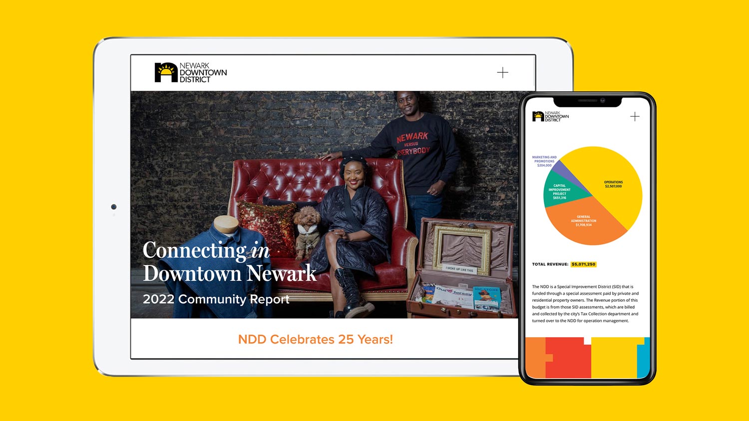
Let’s tell your story for millions to see. Designing and building an interactive microsite for your annual report can have endless possibilities. As a self-contained website, the annual report does not need to utilize your regular website design (but can). Your navigational items can act like a table of contents so users can easily choose what they want to see and read. Your topics or content can span multiple web pages and vary in length.
A microsite, or a small website, has many advantages when compared to the print and PDF counterparts we discuss below. The obvious advantage is that you do not need to print or distribute booklets, which can provide you with significant savings on printing and postage costs. You can also add dynamic content such as video and subtle animations as seen on many current websites. Our non-profit clients like to include donation portals to support their fundraising goals.
One thing to be aware of is that web development can take time, especially since the microsite needs to display cleanly on desktops, laptops, and mobile devices. In many cases, taking advantage of a template system can reduce web development and get the microsite published faster. This format is becoming the new norm for many non-profits. It is progressive, contains interactive media, allows for easy updates, and can even be reused in subsequent years with minimal modifications.
Pros:
- A modern way to share your story and impact
- Displays in the office, at home, or on the go
- Available for the world to see
- Eliminates printing and postage costs
- Interactive features such as forms and surveys can be incorporated
- Can be updated or edited easily
Cons:
- No easy print/PDF conversion
- Custom web development can take time
- Nominal expenses for web hosting
A Digital Scrolling Story Annual Report
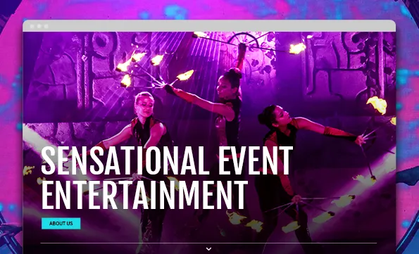
When you want to tell a story in a linear, or timeline way, a scrolling annual report could be a great fit. One long scrolling web page can walk a patron through a story. As a user progresses through the scrolling page, content can change, animate, and capture their attention.
We take advantage of an effect called parallaxing to make transitioning down the long scrolling page more engaging. Parallaxing moves pieces of website content at different rates as you scroll. For example, a background may move slower than an item in the foreground as you scroll downward on the page. This technique creates a lot of depth and interest.
Since so few annual reports take advantage of parallaxing, it can present a unique digital experience for your patrons.
Pros:
- Contemporary method for storytelling
- Includes benefits of a webpage (including video, interactivity, links)
- Adjusts for mobile devices automatically
- Great for linear storytelling
Cons:
- Can take extra time to perfect
- Animation can be hard to picture during design phase
- No easy print/PDF conversion
- Needs separate subdomain or URL
Printed Annual Report

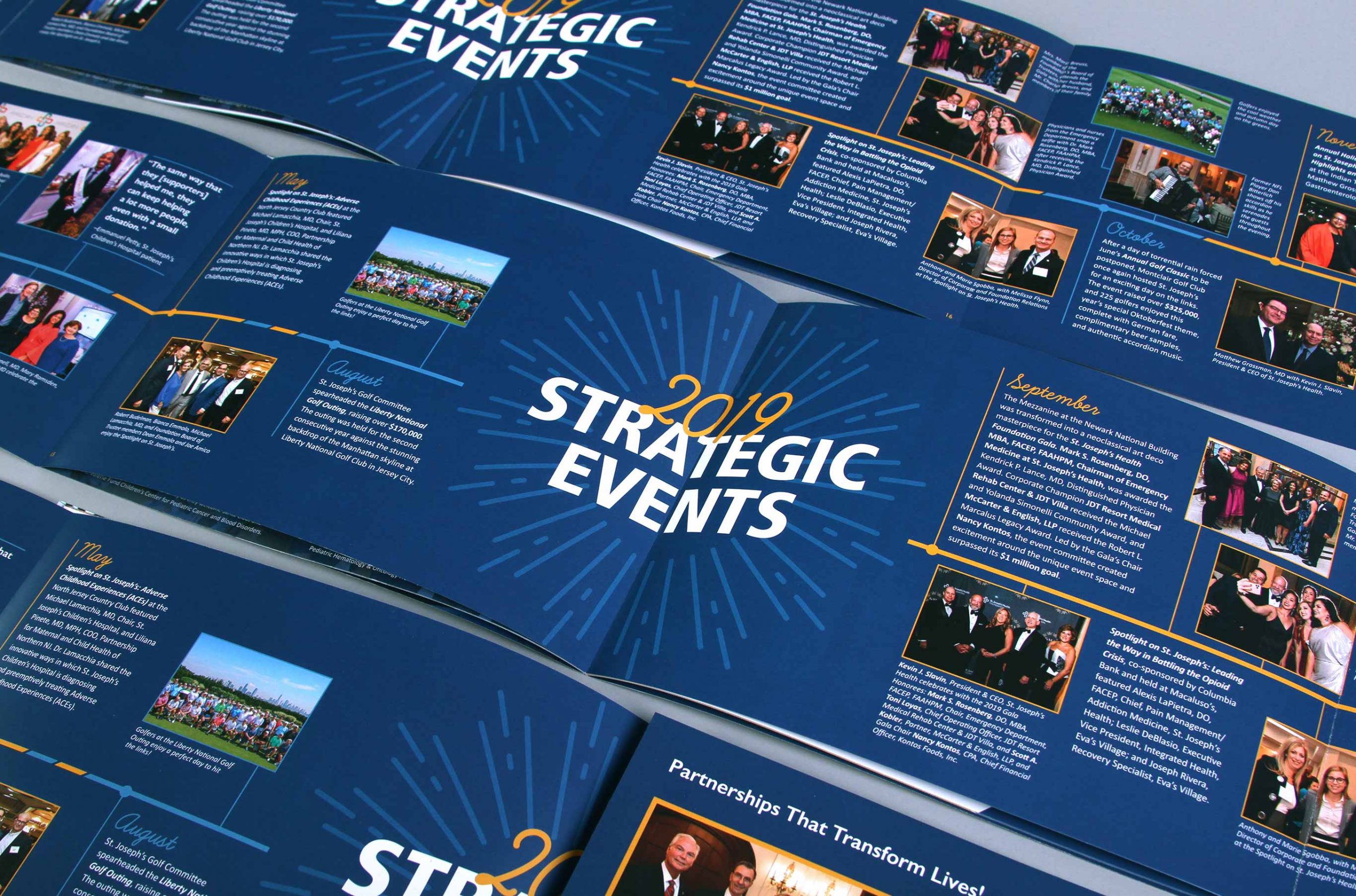
The printed annual report was and still is a major staple in recapping the past year and highlighting accomplishments of the organization. Great design, writing, printing, and finishing techniques can help to make a statement in an annual report design. That’s been the case for many years, but as more and more organizations look to be able to distribute digitally, the printed annual report is becoming the exception instead of the norm.
Still, a printed annual report has its place for many non-profits, because of the clear tactile advantage it has over digital counterparts. Utilizing nice papers, varnishes, embossings, foil stampings, and die-cuts can bring so much dimension to help tell your story and accomplishments. And, surprisingly, the turn-around time to design and print an annual report is a little faster than more complex digital endeavors.
Pros:
- Tactile, unique formats
- Endless production possibilities
- Dimensional and has presence
- Tried-and-true presentation
Cons:
- Printing can be expensive and time consuming
- Mistakes found after printing can be embarrassing and expensive to fix
- Mailing/postage costs in addition to design, writing, and printing
- Can be perceived as old-fashioned
Printed Annual Report with Digital Interactive Version

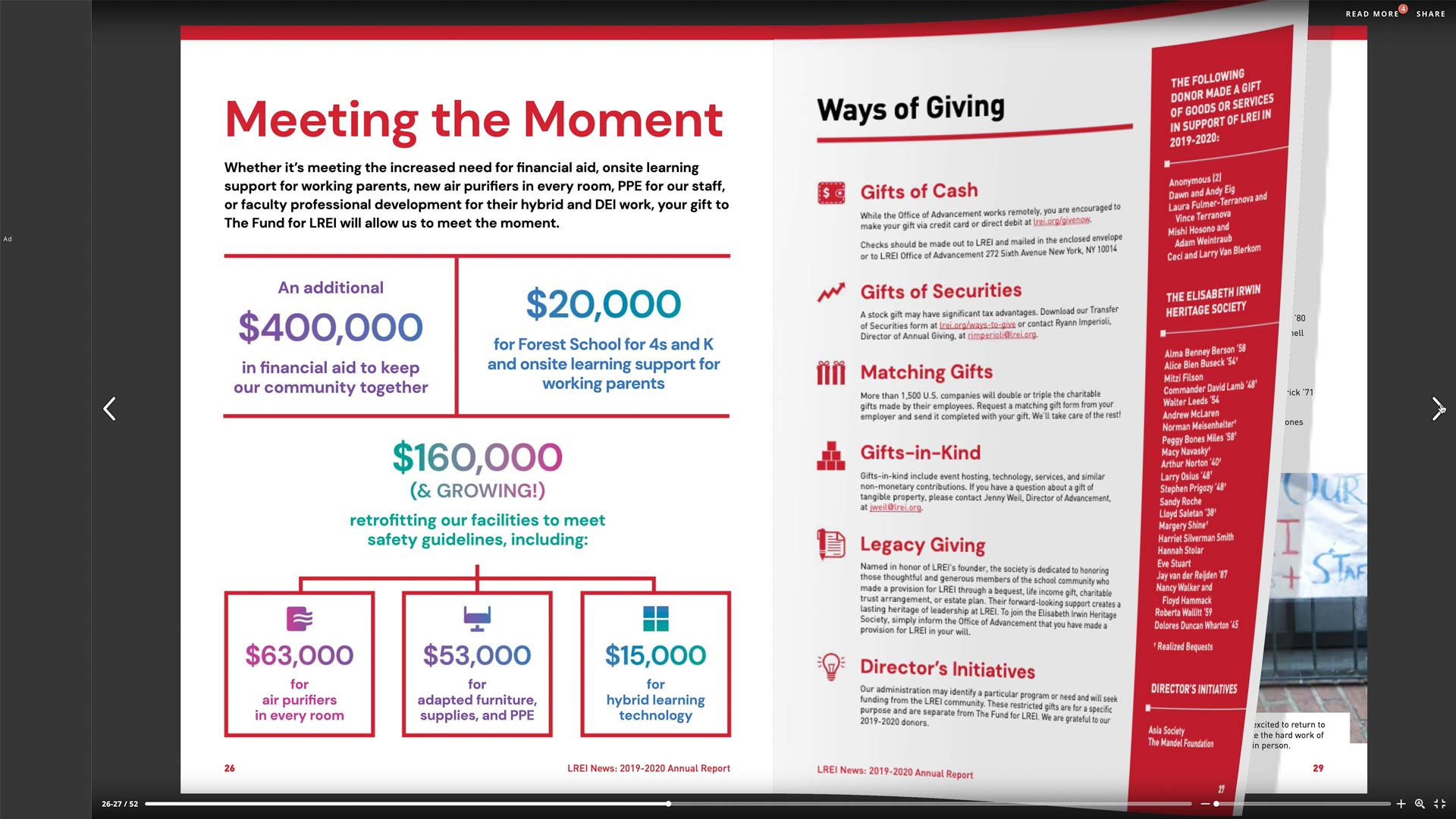
Nearly all printed annual report designs end up on the organization’s website as a PDF. But it doesn’t need to stop there. Flipbook-style tools for your website, including third-party services like Issuu and Flipsnack, can transform a PDF of your annual report by adding animated page turning and interactivity to help modernize it. The services can work on mobile devices too, though the text will be tiny on smaller screens. If you have a print annual report and want something more than just a static PDF to download on your website, these tools and third-party services can be worth the nominal cost.
Pros:
- Easy and fast to implement from a PDF
- Can be viewed in modern web browsers
- Gives a smidge of tech feel without any web development
- Services have free plans (with additional paid capabilities)
- Ability to embed URLs and create linking table of contents
Cons:
- Not entirely mobile friendly
- Challenging to have content listed in web search engines
- Viewing on smaller screens can be difficult
- Potential additional nominal subscription costs
Only Design a PDF of Your Annual Report

We are seeing companies only creating a PDF of their annual report with no intention of printing—saving money on printing and distribution. Much like the printed annual report, a graphic designer will utilize page layout software such as Adobe InDesign to create it. You can email the PDF (as long as the file size isn’t too big) or add it to your website where it can be easily downloaded for anyone to see.
Page quantity is not limited in a PDF but special consideration should be given to its size. Nearly all digital screens are in a 16×9 aspect ratio, so we recommend utilizing these dimensions. This would ideally be a landscape format to accommodate laptops, desktops, and horizontal mobile devices. The ability to have as many pages as you need is a big benefit and can provide more real estate for impactful statements and facts.
If you know your annual report will only be produced as a PDF, you can take advantage of some unique capabilities. A PDF can include clickable links, an interactive table of contents that links to other pages in the document, and even embedded video and audio.
Pros:
- No printing, mailing, or web development required
- Not limited to page count like printing
- Can have an interactive table of contents
- Can include video/audio
- Links can be created to web pages (on your website or elsewhere)
Cons:
- Embedded media can make file size too large for emailing
- No tactile elements
- It needs to be downloaded
- Mobile experience can be hard to read
A Video Annual Report
With so many people watching video content online, it’s no wonder why organizations are turning to video storytelling, especially for an annual report. Most people do not read every word in a traditional annual report, or even on an annual report microsite for that matter. But they will watch a short, impactful video from start to finish.
Most people do not read every word in a traditional annual report… But they will watch a short, impactful video from start to finish.
With a video annual report, the story needs to be extremely brief (less than three minutes). In this short time, the messaging needs to be impactful, the visuals compelling, and the audio (voiceover/music) captivating.
Video is a great format in a digital world. What makes a video interesting and unique compared to the formats listed above is its shareability. Your story can be shared in one video on social media or on your website. The video can also be sliced up into shorter clips and shared widely on social media or in email campaigns.
The video should be carefully scripted, recorded, and edited. Quality lighting, microphones, and recording equipment should be used—even if you think your phone is good enough. The use of a gimbal can help steady your cameras or phones and virtually eliminate any wobble from holding the device in your hands. Branding should be incorporated throughout the video through static and motion graphics.
Pros:
- High levels of engagement
- Touches many senses
- Very sharable format
Cons:
- Video production can be expensive
- Not everyone can be natural in front of the camera
- Lots to plan and set-up for, even for a short video
- Recording equipment can be a barrier of entry
Annual Reports are Changing
As you can see, there are many annual report formats possible. Setting a budget, planning a timeline, and determining the best way to share your message should be the main driving forces behind choosing what’s best for your organization. If you have questions about your upcoming annual report, give us a call at 908.219.4703 or complete our contact form. We’d love to help you decide the best way to tell your story.


