As a graphic designer and art appreciator at heart, I love the nostalgic atmosphere of Wildwood, New Jersey—especially the typographic signs and retro designs the area is known for. Several years ago, I photographed and blogged (Typography and Signage of Wildwood, NJ) about the cool signage, but those images were taken during the day. This time around I wised up and captured the typography and neon signage at night—when this iconic Jersey shore town is hopping with thousands of vacationers.
Wildwood is a family-friendly summertime destination located near the southern tip of New Jersey. It has wide, gorgeous beaches and a 2-mile long boardwalk that includes dozens and dozens of boardwalk games, rides, food and entertainment. The community—which is known for its retro, art-deco hotels—fully embraces its longstanding tradition of being a hot vacation spot for millions of people from New Jersey, Pennsylvania, New York, Connecticut and even many from Quebec, Canada. Not surprisingly, in this entertaining environment where the competition is serious between vendors and business owners, the town is also home to some wonderfully designed, eye-catching neon signs that can date back over forty years.
One evening, I cycled around town to photograph some of the signs that really stand out for style and design. (I also discovered it’s not so easy to shoot these signs at night.) Included is just a glimpse into the heritage of the hand-made signs and the craftsmanship that to this day gets graphic design nerds like me excited. So take a step back in time and check them out.
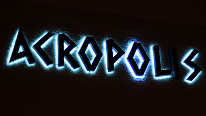
Even when I was a young child, the Acropolis had its fair share of issues. The one time we were about to stay there, my uncle and father were so upset by the condition of the rooms, that we left for another motel. The light out in the “i” makes me wonder if things have changed over 30 years later.
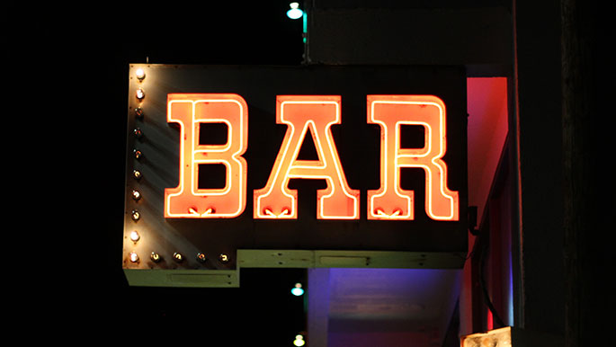
I liked the “BAR” sign because its lights are animated and blink.
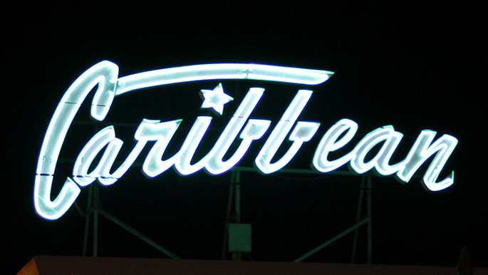
This sign definitely appears a light teal but if you look at my photos of the Caribbean that I took for “Typography and Signage of Wildwood, NJ“, the sign is red. Not sure if this was repainted since because I did not see it during the day.
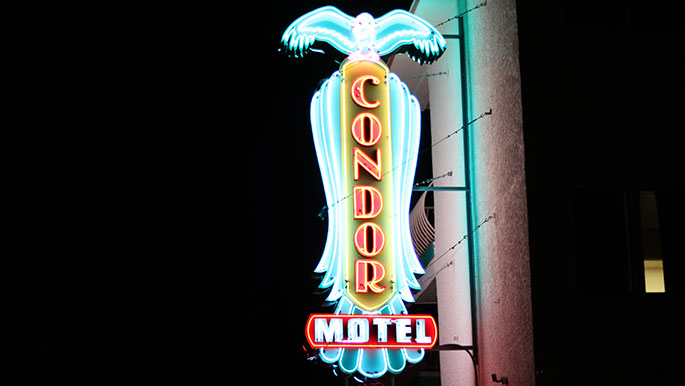
Out of all of the neon signs that I photographed, the Condor Motel is my favorite because of its strong art deco styling and a typographic solution that is designed and executed very nicely. The colors are varied and brilliant.

The Florentine Motor Inn wins the award for most colors and typefaces. All of the different sizes and colors are very jovial and add to the charm of Wildwood, NJ. I know it’s a lot but it’s ok to me.

The Gondolier sign is very bright and probably one of the signs that is closest to the ground. With its unobstructed view, you can’t miss it as you travel down Ocean Avenue.

Harbor Light Family Resort neon sign is very vibrant in color and stands out on the north end of Ocean Avenue.
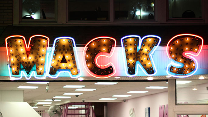
Macks Pizza sign located on the famous Wildwood boardwalk is also featured in “Typography and Signage of Wildwood, NJ“. The use of neon and animated light bulbs of this sign allows you to step back in time.
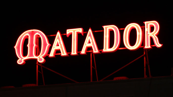
Matador’s sign is a bright red and is visible from a distance since it is on the top of the motel. It does need some kerning between the “A” and the “D” (there is too much space there). This motel also has very nice typographic use of the room numbers on the doors. They are large white numerals on red doors.
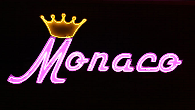
Monaco stands out since it is one of very few that utilize purple neon. Since it is so bright and closely mounted to the brick wall of the motel, you can bask in purple neon reflected light. I wish I could have captured this better for you. I guess you will have to visit Wildwood to see it with your own eyes.
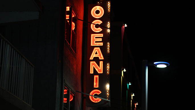
The Oceanic is a cool vertical neon sign. I like the gothic “O” and “C’s” but wish the “E”, “A”, and “N” were a little narrower.
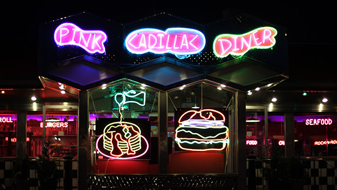
What would the Pink Cadillac Diner be without a neon pink Cadillac? Not sure, but you can see the photograph of it in “Typography and Signage of Wildwood, NJ“. The photo was taken during the daytime. This retro diner has lots of chrome on its facade which helps to reflect the use of neon. As you can see above, there is a bunch of neon signage to be reflected.
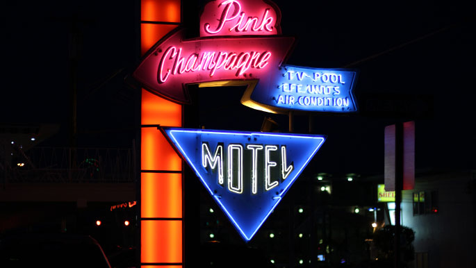

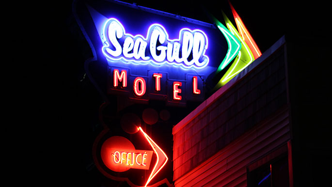
Seagull Motel also features lots of colors. The arrows on the right side of the sign animate.

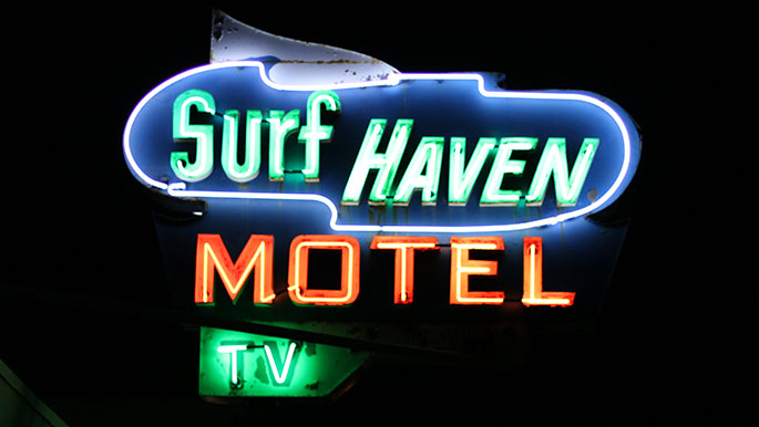
Gotta love the animated light bulbs on the outer edge of this neon sign. Another oldie but goodie.
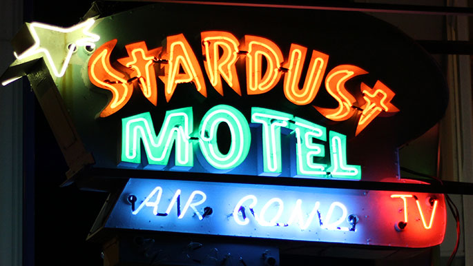
Super excited that the Stardust Motel has TV! Adds to the appeal.
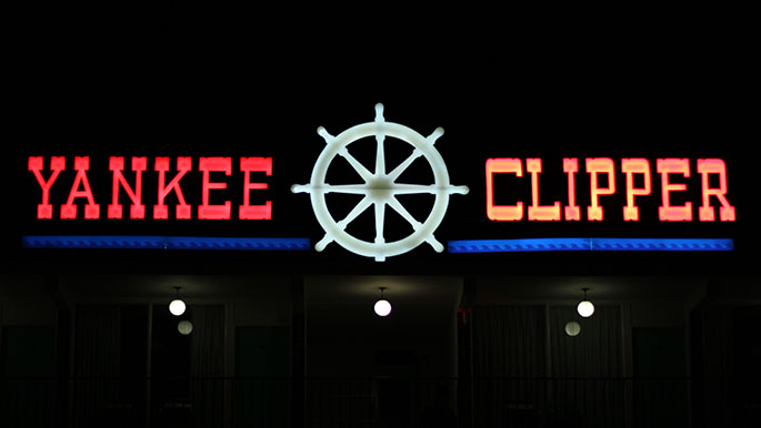
The Yankee Clipper may not technically be a neon sign but it is huge and at the top of the building. It is very bright and marked the end of my Wildwood escapade.
Did I miss any of your favorites? Do you know of a great design that I have not featured? I want to know. Just complete the contact form here.


