When you think of the Broadway show Phantom of the Opera, you may immediately picture a white mask on a dark background. Even if you’ve never seen the show, you remember that image. That is memorable key art.
Key art is a mixture of a show’s title and artwork that captures the essence of what the show is about. A show’s key art is featured in nearly all of its posters, ads, signage and more. At Trillion, we work with a number of different theatres, and creating key art is one of the more complex and creative aspects of our design work.
Having top-notch key art is the single most important aspect of your publicity. It gets people excited about a show, but it also speaks to the quality of the production. If your key art looks homemade and unsophisticated, or too busy, the audience will get the sense that the show will be second-rate.
The key art is a vital asset for all of your marketing materials: mailers, posters, banners, emails, social posts, and programs, hinting to the potential audience what they can expect to see. It is a critical component to marketing a show either before high-quality production images and video content is available or afterward to reinforce the show’s brand. How do we make sure the art captures the show’s true essence?
Start with the Show
The process starts with learning about the show: the plot, the themes, and important visuals in the show. We want to get to the heart of what people love about the show but also do it in a way that reflects the theatre’s unique production—especially if it is an established or traveling show. Every theatre has its own personality and type of audience they are serving, so you may have your own interpretation of the show. If you are producing a show that is completely original, creating the key art from scratch is even more important.
If the show is well-known and you do not want to license their key art, you must determine how much to lean toward recognizability and how much to put a fresh spin on something that may have been produced in many different theatres over many years. You should be aware of the show’s copyrighted look or assets to help determine if using some hint of style, color, or other elements from the original would be acceptable to the copyright owner. It is an intriguing balancing act. You don’t want to reproduce art that is already out there or trademarked, but you do want the key art to be impactful enough to get people excited.
Great Key Art for Theatres Comes from Collaboration
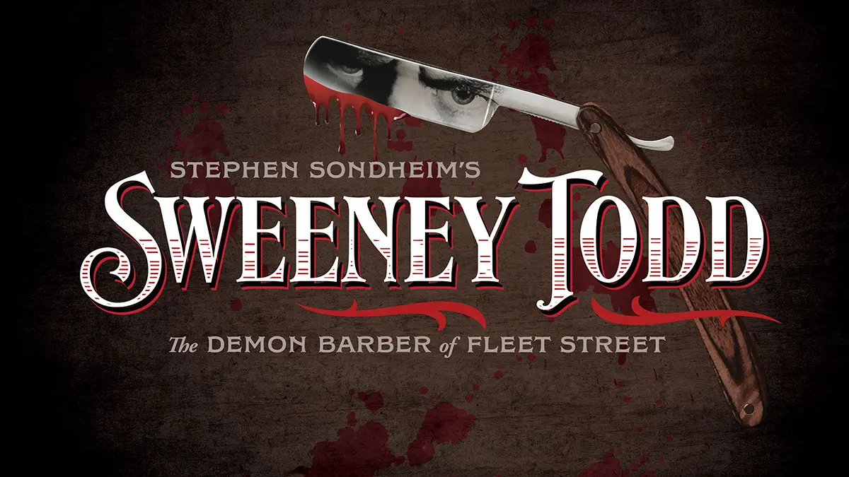
The key art needs to convey the subject matter but also the personality and energy of the show; it should be emotive. The artistic staff usually understands what is special about the show and has ideas about how to translate the plot, music and choreography into artwork. It can make for a very creative collaboration. For example, for a production of Sweeney Todd, the theatre set out to shock and thrill the audience by placing actors in the aisles and embracing campy levels of gore. That gave us a great start on design ideas.
Pencil It In
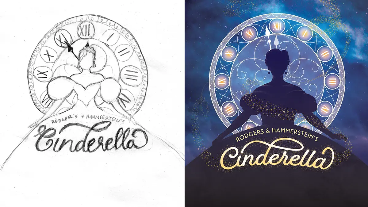
Once we have agreed on our understanding of the show, we use pencil sketches to experiment with different ways to represent it. We usually create a few directions to show the client.
Because creating key art can be time-consuming and complicated, we get agreement on the concept during this phase before developing anything further. Alongside the sketches, we also present other visuals that inspired us: art from the time period in which the show is set, an example of lettering, a swatch of color, or some samples of an effect like spray paint or watercolor. This helps to illustrate style and transmit the whole concept of the key art, giving the theatre some specifics to evaluate.
Preliminary Artwork
Once the concepts are narrowed down and approved, the second phase is preliminary artwork. At Trillion, we tackle composition, color, and texture. We keep in mind that key art will be produced in many different aspect ratios: a long vertical street sign, an outdoor poster, a tiny digital banner ad, so the elements in the key art will need to be considered and rearranged to accommodate all those different parameters. We need to ensure the title is legible in any size or incarnation. It’s helpful to simplify the design to a few essential elements: a title, a background and a key visual. You want to be able to break apart and shift those elements around to work in any configuration and keep it readable and recognizable.
How to Make Key Art Memorable
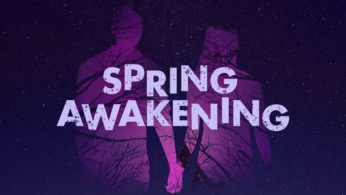
Key art is the opposite of subtle! The theme and flavor of the show should not be in doubt. Push the emotion, push the colors, and be creative and artistic with the title. Typography is the voice of the design, so let the lettering of the title evoke the time period or the setting – it could be whimsical, it could be suspenseful, or very dramatic and illustrative. Focus on the essence of the show and what makes people love it, then ensure that comes through in the artwork.
Creating Key Art is Highly Skilled
Once we get client feedback and approval on this phase, we go into final art. This is when we flesh out the forms, customizing, filling in, incorporating texture to create depth, and figuring out the background. In the preliminary phase, we might just choose a single color to allude to the background, but now we want something more expressive. In the case of Sweeney Todd, our background has a grainy wood aspect to it, grungey and dirty looking. We didn’t want it to look flat, clean and graphic; we wanted a tactile background.
Getting the Key Art Ready to Use
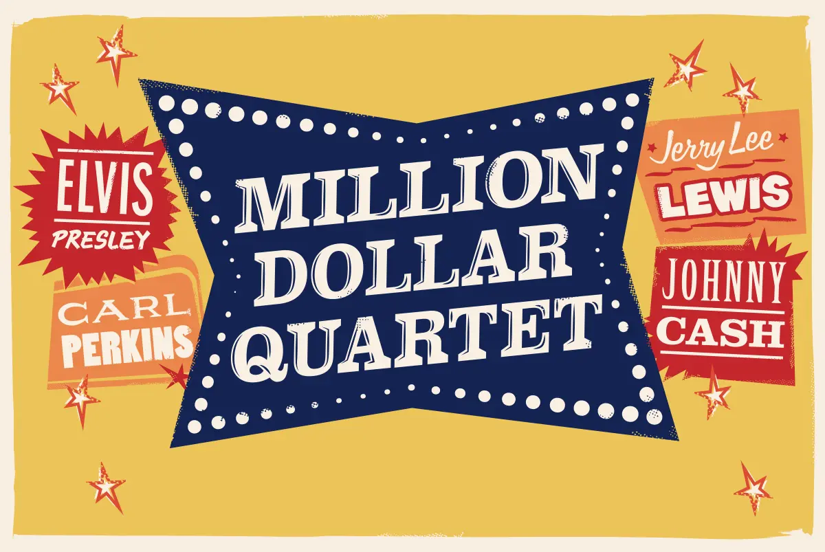
When the key art is finalized, it is time to create a package of assets that can be used by the internal team as well as by us to design all the different pieces needed for marketing: direct mail, advertising, social media, emails, etc. The package elements include the title, both for a vertical or horizontal layout, horizontal and vertical versions of the background, and whatever key elements exist. They will each be set by themselves on a transparent background so that they can be placed in assorted configurations to make a layout quickly and to reduce the digital file sizes.
Key Art Needs Time
Because so many materials will have to be printed and mailed, plan a comfortable amount of time to develop and create your key art. Often a theatre will be starting up digital and print communications in advance of their new season with all the upcoming shows advertised, meaning that the key art for all those shows needs to be ready. Starting a couple of months before those materials are needed will give you the appropriate amount of time. If you are tight on time or budget, you may want to consider licensing the established key art from the show’s creators.
Great Key Art Sells the Show – and Your Theatre
Having professional, beautiful key art will sell your show in more ways than one. Not only does the art tell us about the show itself, but the professionalism of the art will come through when you are soliciting new ticket buyers or subscribers to help grow your audience. In the signage outside the theatre promoting the season or each show, as people drive by or walk through downtown, high-quality key art will create the best possible impression of your theater.
We have created memorable key art for many different types of theatres all over the country. If you want to give your upcoming season and productions the best possible representation, we’d be delighted to help you. Our talented and creative team is waiting in the wings! Reach out to us by completing our contact form or calling us at 908.219.4703.


