Understanding ad specs helps make your ads look their best.
One of the keys to having your print ads look their best is to follow and understand dimensional specifications required by publications. Sounds pretty obvious right? In fact, many advertisers fail to prepare their ads correctly which can result in important information getting lost when the ad goes to print. In this article, we explain the differences between these important measurements and why they matter.
The parameters are simple for a “full-bleed” or “full-page” ad. Follow the instructions closely regarding trim, safe area and bleed and you can be sure that your important information will be placed correctly within your print ad. In practice, these dimensions compensate for variations in the trimming and bindery of a publication—variations which can be small but highly critical. The bleeds and safe areas allow for safe tolerances in case a shift happens when the publication’s pages are assembled and cut to size.
Trim
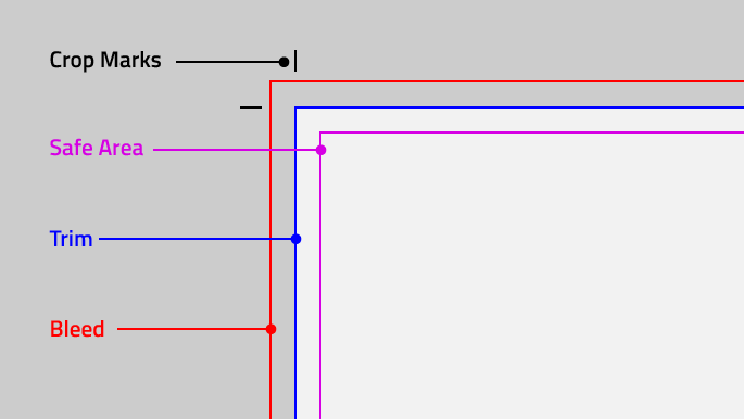
Trim size represents the final dimensions of your ad. For full page ads, this is also the size of the publication. However, artwork and photographs must extend beyond the trim size (see “bleed” below) to avoid narrow slivers of white at the edge of your ad once it is cut to size. When ads are prepared by your graphic designer, small lines in the upper and lower corners called “crop marks” indicate where an ad is to be trimmed.
Safe Area
This is an area inside the trim. Safe area is a smaller dimension than your final ad size and is important to pay attention to because this is where you should place your most important information within your design. Any content outside of this area is in risk of being cut off!
The safe area can also account for the gutter, or middle, of the publication and how easy it will be to see content in the center of a magazine spread. Safe area on many print ads can be as little as .125” or as large as 1”. If your advertisement is going to be a poster that will also be displayed within a metal frame, the safe area might be even larger to accommodate for the overlap from the lip of the frame.
Bleed
Bleed is the portion of your design that extends past the trim size. Bleed is cut off when the publication is trimmed to the final size. Its sole purpose is to make sure your design or image reaches the very edge without leaving any unsightly white edges. Bleed is commonly .0625” – .5” larger than the trim size but it really depends on the ad size and how it will be trimmed.
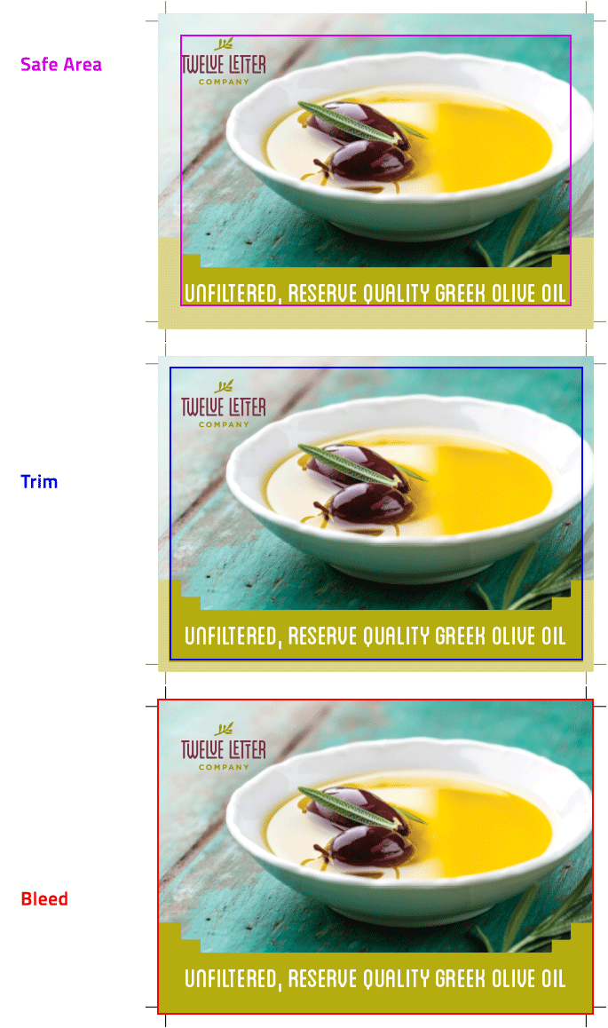
Above is an example of a postcard Trillion designed for Twelve Letter Company. This example shows how we send the file for printing. It has a safe area (shown by the magenta rule), trim (shown by the black crop marks and blue rule), and bleed (shown by the red rule), which will be trimmed.
When it comes to ad sizing, tiny fractions make a difference.
We hope this article helps explain these important dimensions. Trim, safe area and bleed can be confusing and are frequently overlooked by less experienced designers. After all, Advertising space in publications isn’t cheap; that’s why it is critical that your graphic designer get these specifications correct so your ad looks its best once it’s published.
Award-winning Graphic Designers
If you are searching for an award-winning creative team to design your company’s next ad campaign, give us a call at 908.219.4703 or contact us.


