 The Tech Interactive End of Year Appeal
Choosing the best colors for your brand goes way beyond simply selecting red or blue or green. Companies often approach Trillion because their brand colors are inconsistent depending on the vendors who are creating their marketing and promotional materials. In many cases, a specified color palette has not been strategically planned. It’s an easy thing for any business owner to overlook.
However, careful thought and consideration should be given to your colors in order to portray a consistent brand I.D. across many marketing and branding channels. What do I mean by that? Simply put, you should make sure that the specific colors you choose can be clearly defined and consistently reproduced across print media, digital media, apparel and more.
“Colors, like features, follow the changes of the emotions.”
– Pablo Picasso
When you think of Home Depot the color orange quickly comes to mind. For Target the color red stands out and is easily recognizable. Color plays a critical role for brand identification and these well-known companies are excellent examples of how to consistently incorporate a specific color into so many brand touchpoints.
Brand Color Overview
Colors evoke different emotions and represent qualities you may want to associate with your brand. They can also affect the moods of your customers. For example, a healthy living company is likely to choose brand colors that are represented by food and nature, such as shades of green. Green represents balance and growth and is connected to nature, environment, health, youth, and more. It makes sense how these qualities would be connected to both the customer and the brand. But there’s more to choosing colors than just picking a color.
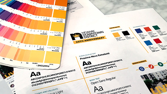
Color matching and comparison
Before Trillion helps our clients select colors, we run through a strategic exercise with our client to help define a brand strategy. This will include a discussion of the emotional drivers that color can be connected to. Colors are known to evoke specific emotions and it’s important that color is presented accurately for a brand.
So how do we choose the best colors for a brand? When the team at Trillion is considering and choosing colors for a brand, we use tools from Pantone and Adobe to inform our decisions. These companies take great care in developing tools that help show and convert color across print, digital and product environments.
Calibration tools for viewing colors and guides for converting colors are the things we are cross referencing in the selection process. We choose colors for a brand so they have meaning and connection so it’s especially important that the colors we select together can be consistently recreated across many platforms.
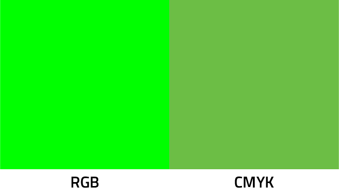
As you can see in the example below, the bright green color that can be produced on a digital screen cannot be accurately reproduced with full-color printing. The bright green will not convert accurately across different mediums.
Brand Color Considerations
There are many ways colors are used and produced for a brand. Here are a few examples of how color is applied in different ways:
- Printed marketing materials with your logo
- Digital screens such as a website or digital billboard
- Product design such as a plastic bottle
- Uniform design or apparel
When choosing colors for your brand, we need to consider the list above and the type of items your brand will be touching.
For printing, there is a subtractive process called 4-color process where four specific ink colors—cyan, magenta, yellow, and black (CMYK) —overlap to create the illusion of full color. There is also a printing method called spot color where inks are mixed into a solid color before printing.
Read our article What’s the difference between CMYK and RGB.
For digital screens, the additive color process combines red, blue and green (RGB) colors to create an expanded color spectrum. This is great for reproducing many colors used in printing but careful consideration needs to be given for the color selections because so many screens are presenting colors differently. You have less control on a digital screen because each person will have different viewing preferences and settings on their screens such as brightness, contrast, and resolution.
For products and apparel, awareness of fabric, thread and raw material color availability are critical. If you know that your team will be wearing your branded aprons as part of their uniform, being aware of standard fabric color options is important. Choosing the wrong color might mean mismatched brand colors or the need for very high quantities or expense to match a custom colored fabric.
Choosing the best colors for your brand is very important
At Trillion, we choose brand colors very carefully. Having a thorough understanding of the brand personality and mission is a critical step in making color recommendations to our clients. When we are going through the branding or rebranding process, we are using the personality, mission and all of the factors that represent the look and feel of your brand to recommend the best colors that will help you stand out among your competitors.
If you need help defining or refining the colors for your brand, give us a call at 908.219.4703 or just fill out our contact form and we will respond promptly.