The 26 letters in the English alphabet combine to create over 470,000 words, according to Webster’s Third New International Dictionary. With just 26 letters to help us compose, create and communicate words and sentences effectively, a graphic designer needs to have an intensive understanding of the nuances between individual letter characteristics and fonts in order to properly and creatively use them in design. Below are some surprising facts about select letters of our alphabet.
The 26 letters in the English alphabet combine to create over 470,000 words…
Some letters are larger than they appear
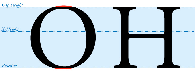
In our alphabet, we have straight letters, wide letters and even round letters. But they are not created equally and can be smaller than they appear when compared to each other. For example, take any round letter and compare it to a vertical letter—say an “O” and an “H.” In order for the “O” to appear the same size as the “H,” we make an optical correction so it ever-so-slightly goes above and below the top and bottom of the “H.” Depending upon the font, C, e, G, O, Q, U can all extend beyond what is called the baseline, x-height or cap-height of a font family. This slight extension of size is called “overshoot.” Take a look below to see what we are talking about.

Certain letters want to break the rules
Much like the round letters mentioned above, A, N, V, W and sometimes M want to be larger than their neighbors and require an overshoot. The points of these letters need a visual extension so they do not appear too small. Depending on the font, such as Futura shown below, the points can be exaggerated and are an integral part of the font’s personality.
Some letters contain an optical illusion
In order for some letters to “appear” correct, artistic liberties are taken. Shorter, varied thicknesses and misaligned strokes of certain letters in certain fonts can be mesmerizingly odd when you get a ruler or straight-edge out. Take a look at the letter X below. You will see that it is not just two strokes crossing each other, but rather uniquely positioned strokes. Another example of the optical illusion is the length of the horizontal strokes of the letter E. See how they are not the same width?

Abracadabra! Letters with hidden compartments
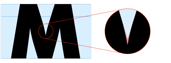
Just like some letters create optical illusions others contain hidden compartments which you may not see unless they get very close to them. If you look at the example below, you will notice the odd shape which is formed on the inside corners of the letter, also referred to as the “crotch.” This is what I call a hidden compartment. Bold and heavy weight fonts are most likely to have these compartments.
The reason why some letters have “hidden compartments” goes back to the early days of printing when large bold letters were used as the headlines for newspapers and posters. The large quantity of ink that was required for these letters caused ink to have “gain,” or spread once printed. These compartments were specifically tooled out of the letters so the ink gain can predictably fill the compartment to create a nice inward point on the letter. The hidden compartments are actually remnants of yesteryear but can still be found in some fonts today.

Why letter characteristics matter
The details of letters vary from font to font. Some of the peculiarities listed above become more apparent in certain fonts, and even extend into lower case letters. At Trillion, we’re sticklers about selecting the proper font for your brand and logo design, or your new, responsive website design. Lettering matters deeply to us. If you are looking for an award-winning graphic design team that can create beautifully effective branding with typography that gets your message across with clarity and confidence, contact Trillion at 908.219.4703. We’d be happy to help your brand.


