
By overprinting I don’t mean printing extra quantities. Rather, overprinting is the process by which one color is printed on top of another color. When this happens, the bottom color can show through the top color and ruin the quality of your printed materials.
Overprinting can yield undesirable results such as incorrect color, or distracting patterns, or imagery appearing where it should not.
Taking advantage of overprinting in the right way can add interest to printed marketing collateral. However, improper or accidental overprinting can often times be overlooked, which can cause problems with your brand image and cost your company financially and beyond.
Overprinting is a term that all printing companies are familiar with but some graphic designers may not understand. Certainly, few clients even know what it is. While the topic is a little technical, below will give you an idea of what to lookout for and how to fix it.
Overprinting is challenging to understand so we prepared animated gifs to help demonstrate.

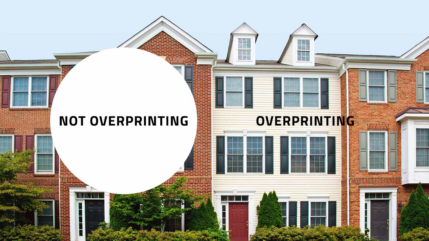
As you can see in the example above, first a yellow rectangle is printed. Then we overprint a magenta circle that overlaps a portion of the yellow rectangle. The part of the circle that overlaps the rectangle is referred to as overprinting.

In the example above, you can see that if the magenta circle does not overprint the yellow rectangle, the colors stay true. You might also hear this referred to as the magenta circle being “knocked out” of the yellow rectangle, which means no yellow ink is printed below the magenta.
Digital files will default to overprinting for certain things.
In the leading design software programs such as Adobe Illustrator and InDesign, objects colored black can have a default setting for overprinting assigned to them. So a graphic designer needs look at how black elements, and those containing percentages of black, are utilizing the default “overprint” setting. Particular attention should be paid if a logo, or piece of art, includes black ink. To combat the issue, you can deselect the overprint checkbox on the object, or change the black to a rich black by adding 30% cyan, magenta and yellow to it.
Above is an example of a black logo we designed for So i Heard Music. On the left, the logo is 100% black with the default overprint setting. On the right, the logo has been converted to a rich black that does not overprint the colorful background artwork. We could have also deselected the “overprint” checkbox on the black object but the rich black will look darker when printing with 4-color process printing. As you can see, the image on the left has the colorful background artwork showing through the logo, which detracts from it.
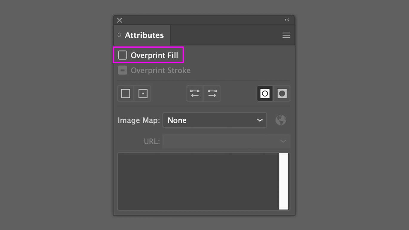
In the example below is a circle that was once black, that retained its overprint setting but changed to white. If you overprint an object that is white, you cannot see it. I’ve seen this issue on files before where an object you do not want to overprint, overprints.
Get the right printed proofs.
Overprinting can often pose a surprise at the worst possible times. When the graphic assets are used in print materials such as advertisements, packaging, posters, postcards, brochures and more, it’s critical to have high-quality printed proofs generated so overprinting can be seen and tested. Most printing companies will email PDF proofs to help reduce project costs and reduce project timelines. The downside of this is that digital PDF proofs my not accurately show overprinting. To avoid risking a bad overprint, ask your printing company for a high-quality printed proof. A printed proof might add some cost and time to your schedule but it’s better to be safe than sorry—especially if you are about to produce many thousands or millions of printed pieces.
Graphic designers need to be aware of overprinting.
Consider your graphic designer as a top-tier creator and steward of your brand’s digital assets. When assets such as logos, illustrations or patterns are being created, a graphic designer must have a thorough understanding of how the assets will be used in the future. Overprinting can yield undesirable results such as incorrect color or distracting patterns or imagery appearing where it doesn’t belong. Experienced graphic designers, such as the team you’ll find at Trillion, leverage the knowledge of overprinting to yield predictable results.
For Business Executives and Marketing Professionals:
As a busy business executive or marketing professional, overprinting isn’t something you should be thinking about. At Trillion, we have an extensive background in understanding the ins and outs of overprinting and how to use it in creative and intelligent ways to improve marketing applications. If you are looking for a new creative team that can build digital experiences as well as printed, give us a call at 908.219.4703 or reach out via the simple contact form on this page.