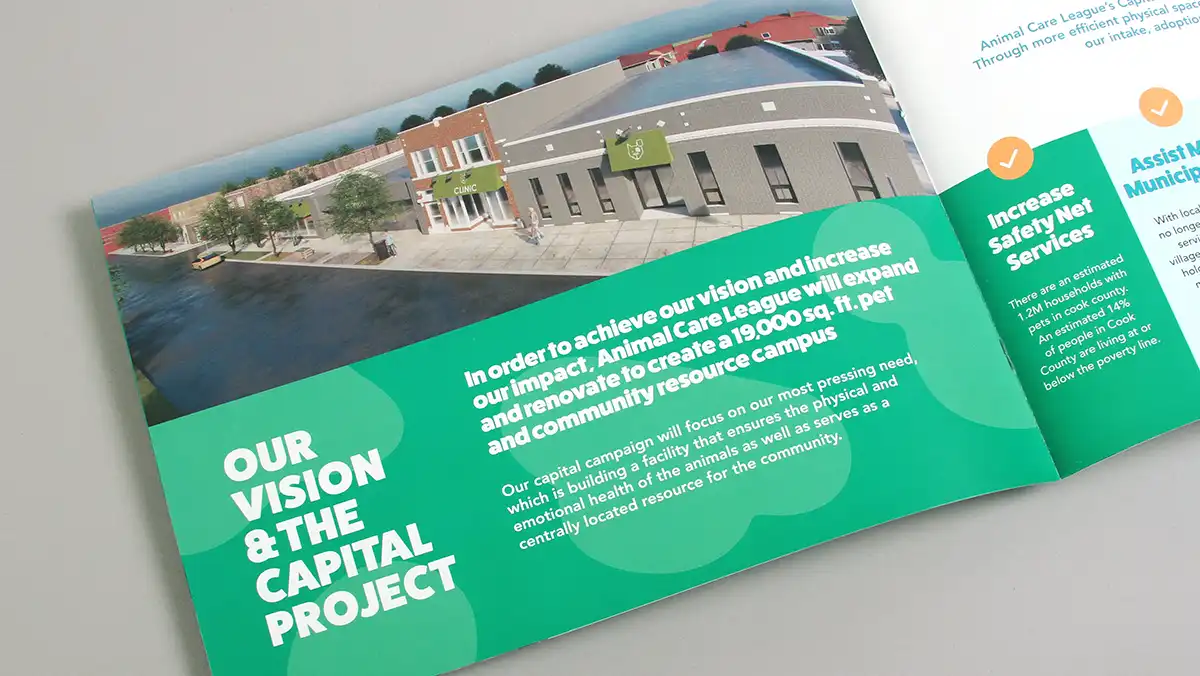
A smartly designed envelope can increase response.
If the details that go inside a fundraising envelope are important, the outside of the envelope is even more crucial. The envelope simply must entice the recipient. Trillion’s creative outer envelope design has yielded consistent results on behalf of our nonprofit clients. We craft them to be simple, memorable and relevant so they are more likely to be opened. In this article, we share some of our successful designs with you to help inspire your next mailing. We grouped these outer envelope design ideas exclusively for nonprofit appeals.
Being unique is a way to get your outer envelope design noticed and opened.
It’s all in the outer envelope.
You would be surprised how many nonprofits overlook the critical importance of their outer envelope design. Your appeal letter, renewal form or request to support a worthy cause will be missed if your outer envelope is not opened. Its design must be strategic and creative to avoid a one-way trip to the recycling bin.
When a graphic design company creates your outer envelope, two factors should be taken into consideration:
- Does their outer envelope design (color, size, shape) grab your attention even when mixed in a pile of mail?
- Does the messaging or visuals on the outer envelope make you want to open it?
If your outer envelope does not pass either of these simple tests, it’s not grabbing attention and will not entice recipients to open it. In this case, a redesigned envelope is needed before sending it out for printing.
Here are four categories of outer envelope designs we have created for our nonprofit clients:
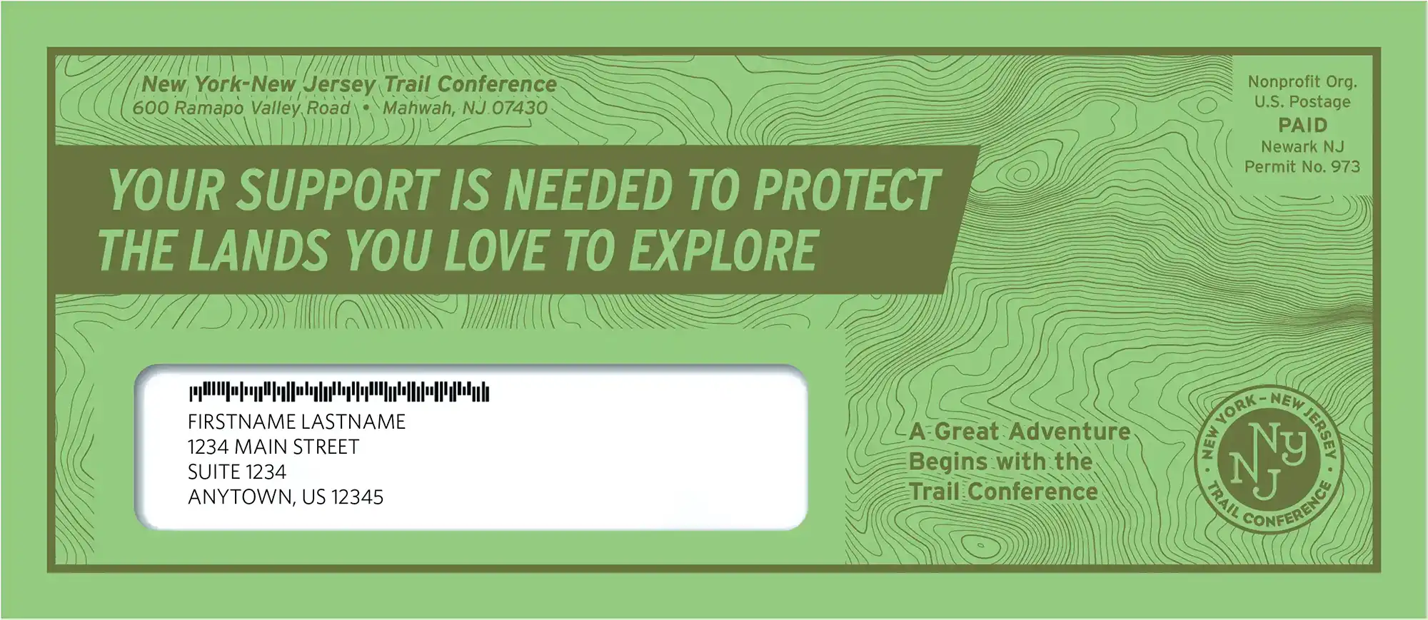
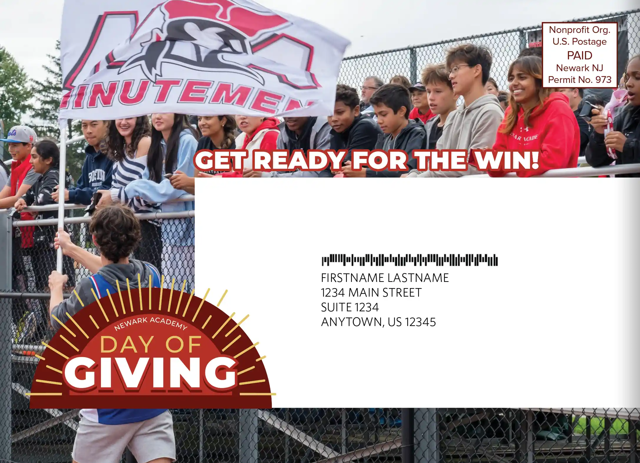
Unique Outer Envelope Designs
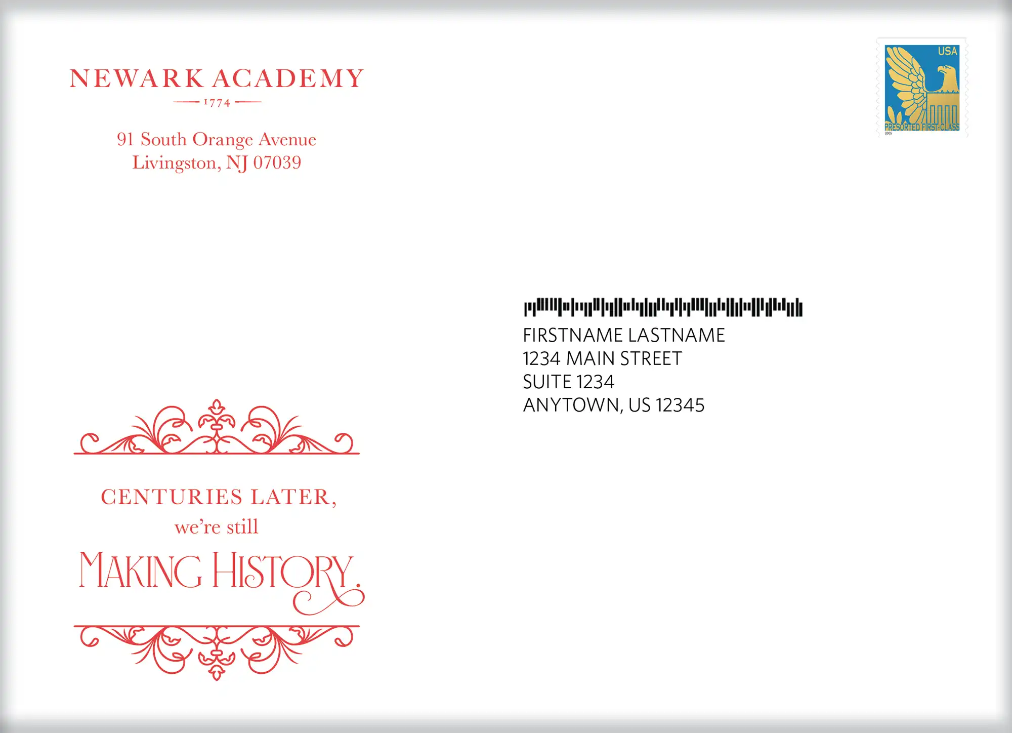
Being unique is a way to get your outer envelope design noticed and opened. Great care and strategic thinking should be given to produce a unique outer envelope design. One caveat: if more expensive finishing methods, papers or printing are utilized, you may leave your constituents, or potential constituents, with the impression that you are not spending your marketing and development budgets wisely, so be conscious of how your audience may perceive the cost.
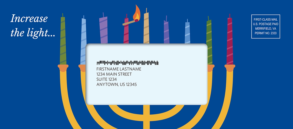
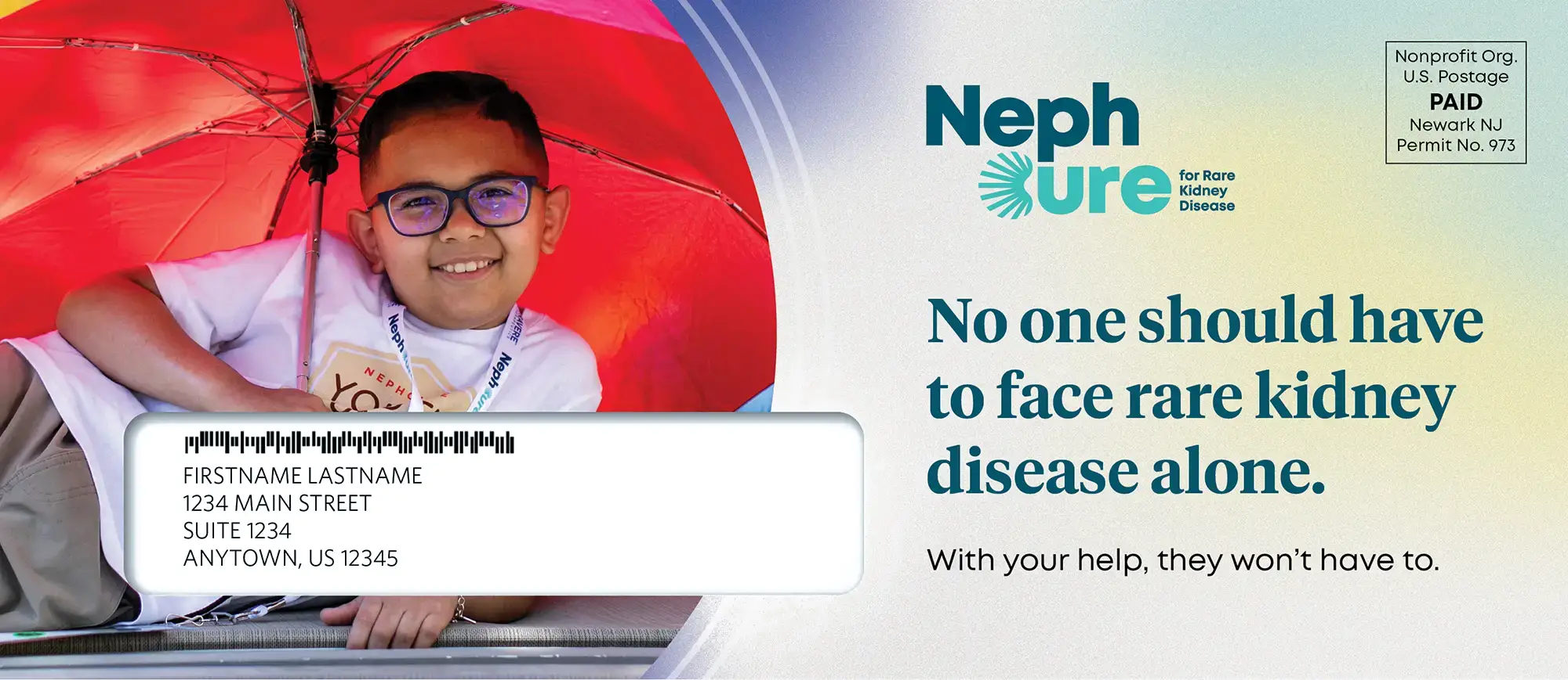
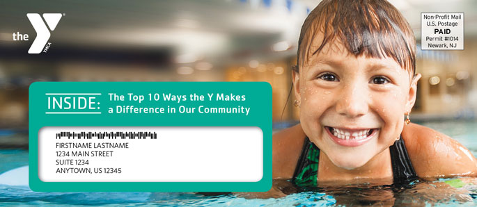
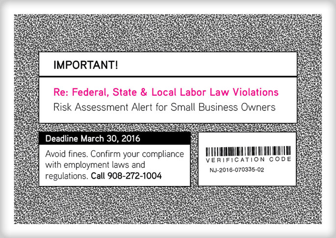
Official Looking Outer Envelope Designs
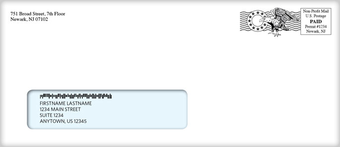
Think “government” notices or envelopes designed to look like they contain an invoice, bill or check. These outer envelope designs can work nicely for membership renewals or sponsorship packets. Additional consideration should be given to the item that shows through the window of the envelope. For example, if a pattern that looks like a check is combined with your personalized address, the recipient might think they are receiving a payment, which could have an impact on whether or not they open the envelope.

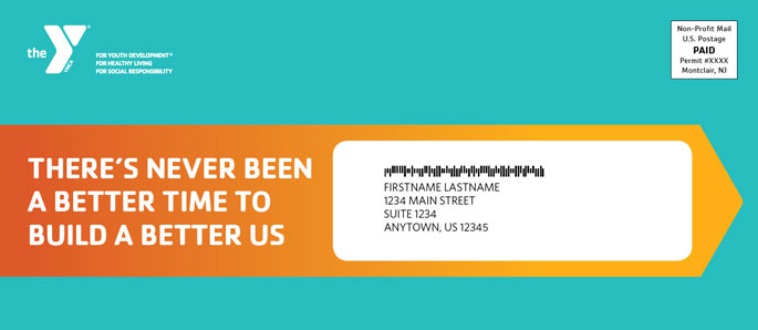
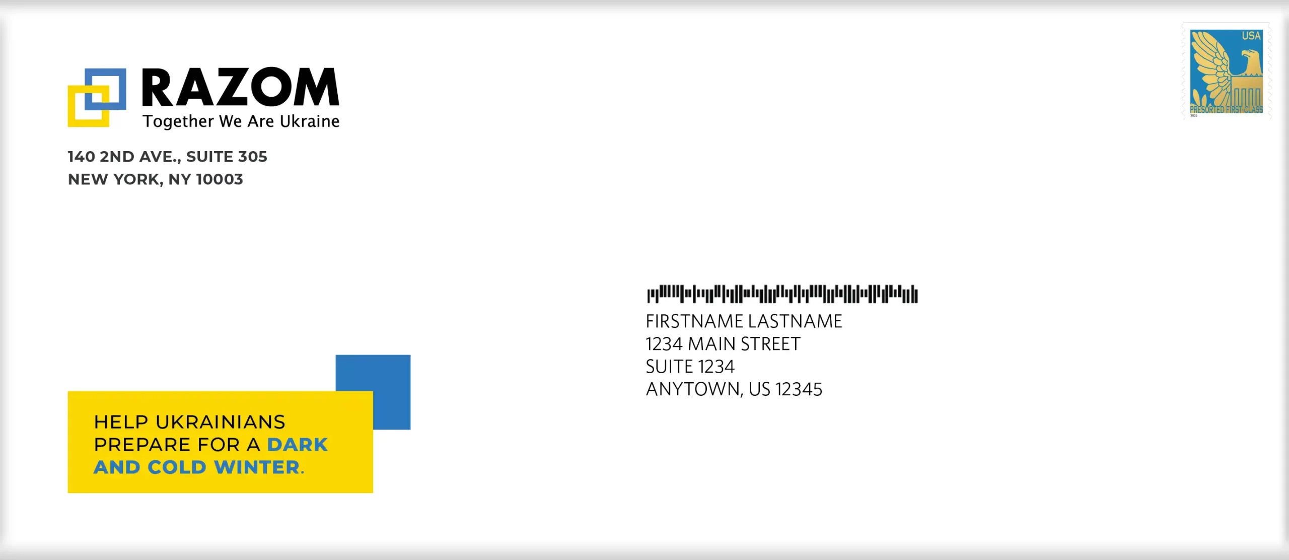
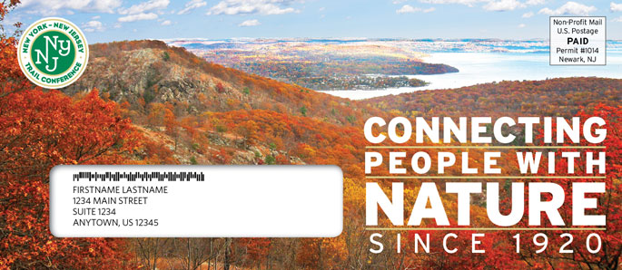
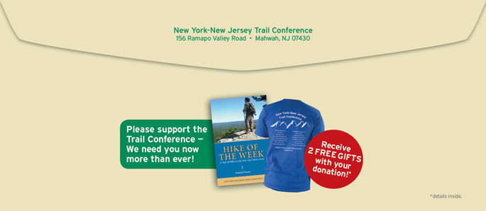
Special Offers Included in Outer Envelope Designs
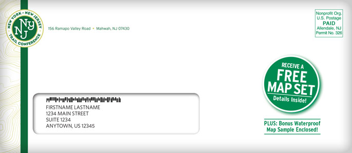
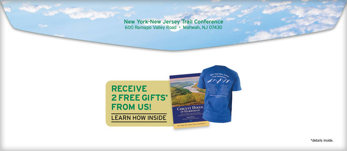
Does the envelope feature an intriguing offer? Matching grants, corporate sponsorships, giveaways, dollar savings and free offers are all ways that your nonprofit might be able to entice a recipient to open the envelope.

Mysterious Outer Envelope Designs
Have you ever received a plain white envelope with hardly anything on it—not even a logo? It leads you to wonder if there is something important inside, right? Blank envelopes frequently get opened simply because it’s human nature to fear that we might miss a check from our bank or some important official notice. While blank envelopes can be effective in certain circumstances, nonprofits need to be careful with this approach because, depending on the nature of your organization, there’s no place for trickery when you’re appealing for contributions.
Let Trillion Design the Perfect Outer Envelope for Your Nonprofit Appeal
Better outer envelopes can give your appeals better results. Contact us at 908.219.4703 or on our website for great outer envelope ideas. Our ingenious designs have made a difference for our nonprofit clients, and our talented team would love to do the same for you!

