- Do you wonder if your logo provides an accurate representation of your organization?
- Do you fret that it’s not reflecting your brand in a meaningful way?
- Have you been mulling over the idea of a logo refresh but don’t know where to turn?
You’re not the first business owner to grapple with the relevance of their logo. As organizations grow and evolve over time, their brands do too, and sometimes the logo that they launched their business with is no longer pertinent.
There are some telltale signs that you should be concerned about your logo and how it represents your brand and/or provides fodder for your competitors. If your company was a smaller operation when it began and it didn’t have the funds to invest in a professionally designed logo, or the logo hasn’t kept up with the growth of your organization, it might be time to put that old logo to bed and look toward the future.
Here are a few common signs that your logo might overdue for a refresh:
Is Your Logo Design Too Generic Looking?
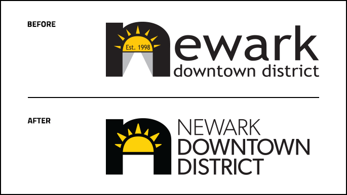
As brands become established and refreshed, sometimes the integrity of a logo can be an afterthought. Often we see new or evolving brands that focus solely on the esthetics of a website without considering how the logo is featured within it. This can divert attention from the logo, which in turn is doing your brand no favors, especially if your logo is the one consistent element that marks all of your brand communications. Even if your logo is only very plain lettering (also referred to as a wordmark) or maybe has a simple icon connected to it, a logo refresh can bring your logo into contemporary form without losing its base characteristics. This can help it to stand more firmly on its own no matter where it is utilized.
“As organizations grow and evolve over time, their brands do too, and sometimes the logo that they launched their business with is no longer pertinent.”
In regards to your logo, you want it to capture the essence of your brand. It’s also great if it can reflect an element of your product or service—whether it be in the lettering or with an icon—as long as it’s crisp visually. In addition, color choices and font selection are crucial components that should be carefully thought out and designed into a logo.
Does Your Logo Design have Too Much Detail?
At Trillion, we love to use the Piccolino Test™ to help determine if a logo design incorporates too much detail. The Piccolino Test reduces a logo down to sizes less than one inch as a means to see if it still remains legible at smaller sizes. If your logo features thin lines or complex illustrations, reducing the logo in size will negatively impact its legibility. Also, too much detail may make reproducing the logo problematic.
We prefer keeping logo designs pristine, streamlined, and clever. The magical space where a small design element can be incorporated into a logo and help tell the story of what an organization does or sells is a winner!
Is Your Logo Design Too Hard to Read?
Sometimes the font that was originally selected for your logo design was not a good choice. We commonly see script fonts as the culprits in the “hard-to-read” category of logo design. The “hard-to-read” factor for a logo may not just be limited to font style either. Logo coloring or detailing can be problematic.
Our tip is to have conceptual logo designs presented in larger and smaller sizes. During the logo redesign or refresh phase of a project, we like to present the logo designs scaled to smaller than one inch in width. Take a look at our article “Does Your Brand’s Logo Pass the “Piccolino Test?” where we talk about simplifying a logo in order for it to read easily—and at smaller sizes.
It’s Not Uncommon to Need a Logo Refresh or Redesign.
Logos can show their age—especially when they were created quickly and in a pinch. A logo refresh or redesign can propel an organization forward. If you are considering a logo update we can help you understand the process and the challenges. Give Trillion a call at 908.219.4703 or complete our handy contact form.
We love designing logos and visual identities. Let yours be next!


