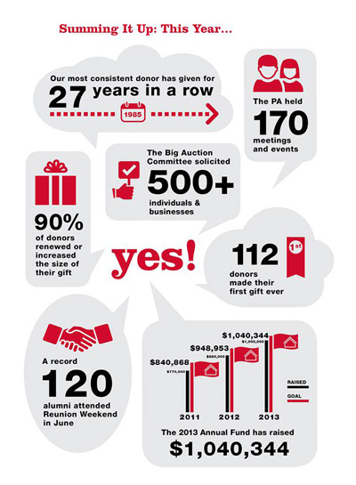
Many schools and not-for-profits are taking advantage of the growing popularity of infographics as a way to illustrate complex data sets. Infographics provide potential donors with compelling, easy to digest statistics and reasoning that helps them see how their contributions can have a positive impact on the organization making the appeal. They can be used effectively in all of your marketing and donor communications.
An infographic takes large sets of data or facts related to a specific cause or topic and crystallizes them into an easy-to-understand graphic depiction.
We introduced an infographic into this year’s Little Red School House annual report. The school’s fundraising team wanted to show the tremendous effort by parents, alumni and staff that goes into each annual fundraising campaign. The infographic summarized the entire community’s effort and highlighted both the contributions of long time donors and new contributors; as well as providing a nice visual break to an otherwise long document that listed donor names and contributions. In the future, the school will be able to include this graphic in other fundraising materials and events, as well.
Here are some items to consider before creating an infographic for your next fundraising initiative:
1. Data sets
An infographic is only as good as the data it illustrates. The information needs to be compelling for the infographic to be effective (i.e. a clear upward trend, a strong positive correlation, a high percentage increase). If you are pulling data from external sources, you should credit those sources the same as you would any other document or publication.
2. Branding
The design of your infographic should fit in neatly with the look and feel of your campaign; or as an extension of your organization’s branding. Consider where the infographic will be shown (such as within an annual report, on a website or a poster) to identify how much information you need to include about the organization. In the Little Red School House annual report it wasn’t necessary to include the school’s logo or mission; but these elements would need to be included if this were a standalone piece. Also, consider the tone you’d like the document to set; should it be playful, professional, informative, serious, etc.
3. Writing
Is your target demographic financial executives, aged 30-50? Or is it college-age students 18-22? Or both? The way you write and present your information for each of these groups will need to be relevant to both in order to be effective.
Do you think it would help your organization’s fundraising to include an infographic in your next campaign? If so, contact us. We’d love to help!


