When designing packaging for a new or reimagined brand, it’s important to think beyond the initial product and anticipate the brand’s future development. Brand extensions (new product categories) and product line extensions (new products in an existing category) generate opportunities for a brand to enhance shelf presence, increase their range of offerings, and to grab customers’ attention. When a brand offers a full family of products, it’s the duty of packaging to promote the individuality of each product without losing a connection to its parent brand.
Two key questions that should be considered when designing a product’s packaging are:
What links the products in this brand and/or product line?
There should be common denominators that tie the products in a brand or product line to each other. Commonalities could include hierarchy of information, primary color palette, font choice, and more. These features help to establish an arresting and cohesive shelf presence. An experienced graphic designer will anticipate the addition of future products and design these common denominators in from the very start — saving time and money on subsequent packages.
What differentiates the individual products from each other?
Items in a product line may be distinguished by factors such as:
- Flavor
- Scent
- Color
- Size
- Ingredients
These differentiators help to keep a line of products fresh and interesting. Changing the color palette, imagery, or any other visual element that pertains to the product’s key point of distinction allows it to stand out and be easily recognized by the consumer. In the future, the “stand out” factor can be cohesively adjusted for new products.

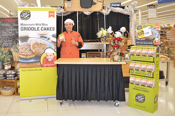
Chef Franco Lania approached Trillion to design his brand and bring it to life across all channels, including packaging for the launch of his first product, Minnesota Wild Rice Griddle Cakes. This initial package design was an opportunity to neatly lay the groundwork for a cohesive, on-brand collection of packaging. The design can be applicable to any future products incorporated into the Franco Lania brand.
The Chef Franco Lania package was designed with three goals in mind — goals that can and should be applied to any brand’s packaging:
1. Cohesively project the brand’s personality.
Franco’s unique brand personality (fun, approachable, knowledgeable, sincere) was conveyed through a bold color palette (lime green and black), font choice, and a photo of Franco’s smiling face at the bottom of the package. These elements will be consistent on all future packages, tying Franco’s products together with his compelling branding.
2. Differentiate individual products from one another.
Products must also be visibly distinct. In the case of Minnesota Wild Rice Griddle Cakes, a secondary orange color, photograph of the product, illustration of wild rice plants, and stamp of Minnesota-grown authenticity are elements unique to the individual product. On packages for subsequent products, these elements will change, striking a balance between standing out and remaining loyal to the Chef Franco Lania brand.
3. Arrange the hierarchy of information in a way that anticipates product line extensions.
Flexible design elements can adapt to different shapes and sizes for different packages. Information should be arranged in a similar way on all packages. For example, the placement of Franco’s logo at the top on lime green and Franco’s photo at the bottom creates consistency between all packages while also allowing their key differences to stand out.
With Chef Franco Lania’s inaugural product now in stores, additional packaging can be developed to fit within the packaging system as new flavors and product categories are added in the future.
Effective package design which is carefully planned and designed from the very beginning has the potential to save time, save money, and add value to your product. If you have questions about how your packaging can help you to build a more successful brand, contact us or call at 908.219.4703.


