 The Tech Interactive End of Year Appeal
The fonts that you use to tell your brand story can say a lot about you to your customers and prospects. That’s why brands like Ikea, Volkswagen and Apple, among many others, have utilized specific fonts exclusively for years and years. In this brief article, I will explain the differences between serif and sans-serif fonts and show you a few examples of each.
When creating documents, your computer may have dozens, hundreds or even thousands of fonts to choose from. Each and every font has its own personality and a preferred use. Whether you choose a font that is thick and bold, or one that is lighter and thinner, or simple or ornate, you will inevitably select either a serif or a sans-serif font. While choosing fonts might not sound like such a big deal, the fact is graphic designers are trained to strike a complementary balance when pairing serif and sans serif fonts. This ensures their designs are not only visually interesting, they’re effective at communicating your brand’s message.
The term “serif” is derived from the Dutch word schreef meaning “line”.
What is a serif font?
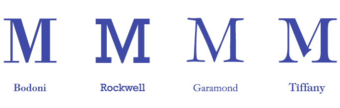
A serif font contains projecting features typically at the end of the stroke on a letter or symbol, including numerals. A serif font can have a simple line such as found on Bodoni, or a thicker line (called a slab serif) as found on Rockwell. Serif font projections are not limited to straight lines either; fonts such as Garamond or Tiffany can have varying thicknesses and curves within the serif. There are many examples of serif fonts available either for a licensing fee or for free (you should read our article on the dangers of free fonts: 4 Dangers of Using Free Fonts for Your Brand).
What is a sans-serif font?
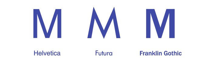
A sans-serif font is exactly that, a font without a serif. Sans-serif fonts tend to have less stroke width variation than serif fonts. Well known examples of sans-serif fonts are Helvetica, Futura and Franklin Gothic. Sans-serif fonts are most commonly used as headline or subhead fonts since they are typically darker and bolder than their serif counterparts. Sans-serif fonts also have become very popular in website design since they tend to be easier to read at smaller sizes on digital screens.
Often the selection of a font can have a significant impact on a brand – in more ways than one. For example, take 14-year-old Suvir Mirchandani. He was trying to think of ways to cut waste and save money at his Pittsburgh-area middle school when he figured out that the U.S. federal government could save approximately $136 million annually on toner and ink if it used Garamond exclusively. As you can see, selecting a serif or sans-serif font can have a lasting effect!
Knowing when to use a serif font or a sans-serif font – or both – is something that a highly skilled graphic designer (like the pros here at Trillion) can recommend. Serif fonts can be easier to read when used in long format body text for print but can become too hard to read on screens with lower resolutions. Sans-serif fonts can work great for headlines and be relatively easy to read on digital screens. Of course, using a combination of serif and sans-serif fonts can make a design or layout more visually interesting in many ways.
Selecting the right fonts for a brand or project is important
If you need help making your company’s design and marketing materials look their best, give the team at Trillion a call at 908.219.4703 and rest assured we will design and select the best combination of serif and/or sans-serif fonts for you!