Choosing the best logo design for your company can be a challenging decision because it’s so important to the success of your business. Once you start the design process, it’s likely that you will need to make a decision between two or more options. So how do you decide between one logo over another?
To begin, when choosing a logo remember to put yourself in the shoes of your prospective customer. Think like they do—not how you do. This is an often overlooked aspect of choosing the best logo design. Just because you don’t prefer a particular color or font doesn’t mean that you should rule out options that might otherwise be viable.
Think like your customers.
How would they receive your logo?
Below are a few top-level logo design attributes that will help you grade a logo so you can project its effectiveness. With this information you should be better able to decide which logo will outperform the others you are considering.
Clarity of a Logo Design
Is the logo design easy to read? This might sound basic but font choices play a big role in the logo’s clarity, both in printed materials as well as digital applications. We like to use the Piccolino Test as a starting point. The test reduces the size of the logo to one-inch wide or less as a means to confirm its clarity at smaller sizes. The smaller sizes can quickly come into play on the web and in many digital applications where a logo needs to remain crisp and clear. Make sure you are reviewing your prospective logo at different sizes ranging from half inch to five or six inches wide.
Logo Design Elements Connected to Your Business
Including an element in the logo that’s connected to your business isn’t always possible, but when it can be accommodated great results can follow. A visual reference to your business in the logo design can prove to be a better option than not having any conceptual connection.
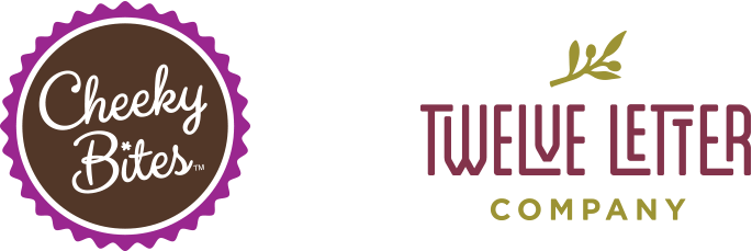
For example, in the logo above for Cheeky Bites (a cakeball bakery), we designed the outer logo shape to be reminiscent to the company’s product shape. In the example for Twelve Letter Company (an artisan olive oil company originating from Greece), we used typography that is reminiscent of the Greek meander motif, as well as an illustration of an olive branch.
Logo Application Flexibility
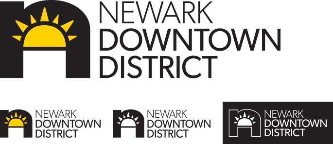
Considering all of the print and digital media that a logo design needs to be applied to, flexibility is key. Applying your logo to things such as embroidered shirts, promotional items, printed brochures or a social media avatar will bring different requirements. Making sure your logo is prepared for 1-color or 2-color printing as well as black or white is as important as having your full-color logo designed. If your logo has enough flexibility to fit into all of these scenarios easily, then you’ve likely made the right choice and selected the better logo design.
Making the Right Choice for Your Logo Design
If you are about to embark on a logo design or logo refresh and need some guidance, give Trillion a call at 908.219.4703. One of our partners can discuss the design process, timing and estimated costs for creating your next great logo design.


