 The Tech Interactive End of Year Appeal
Temple Ner Tamid Capital Campaign Branding
Services
Print Design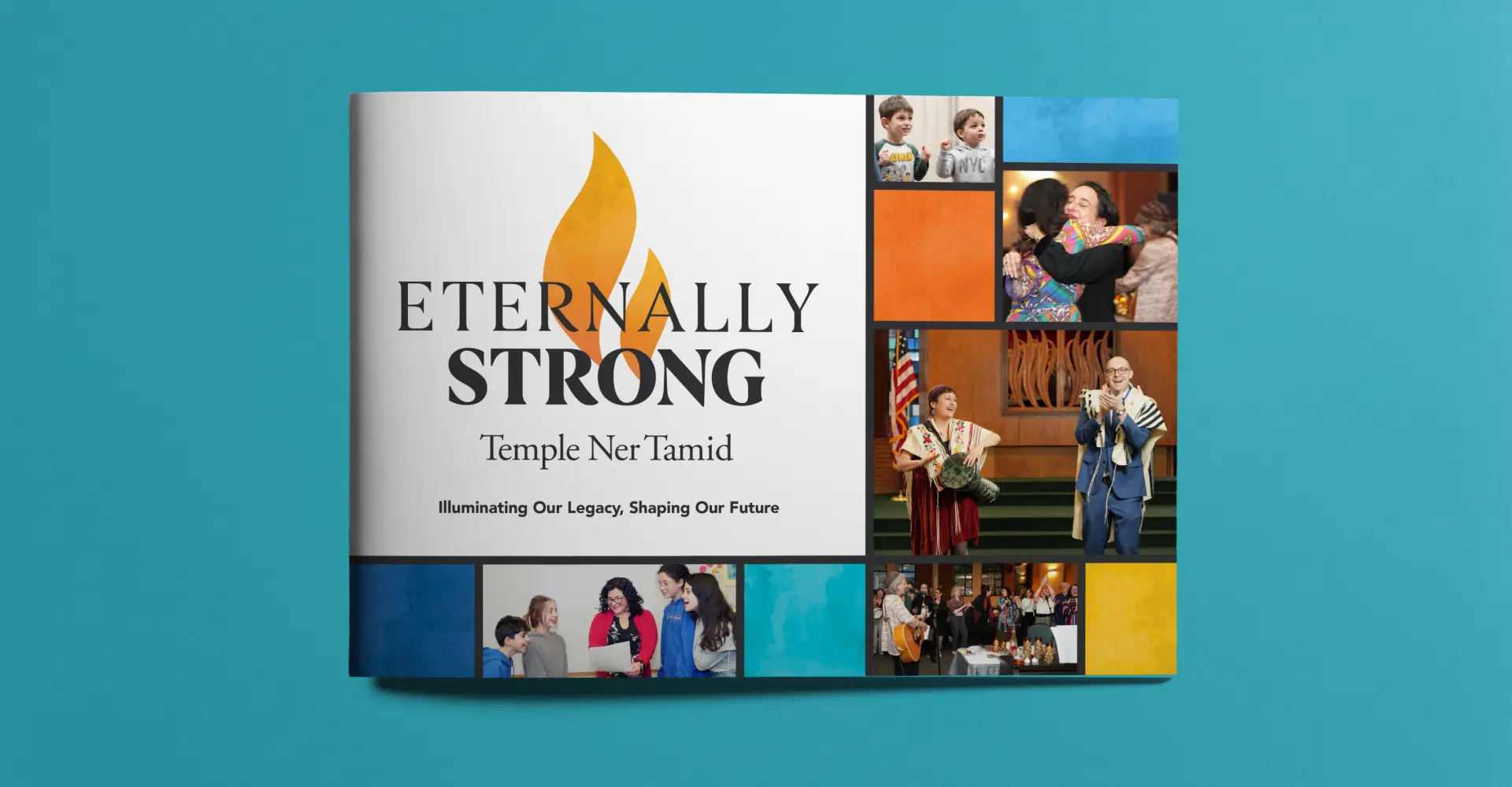
PROJECT OVERVIEW
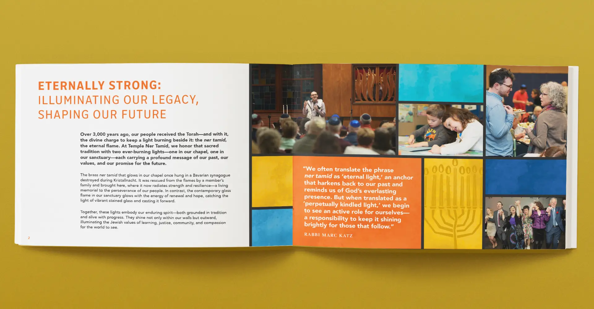
Building a More Welcoming Future
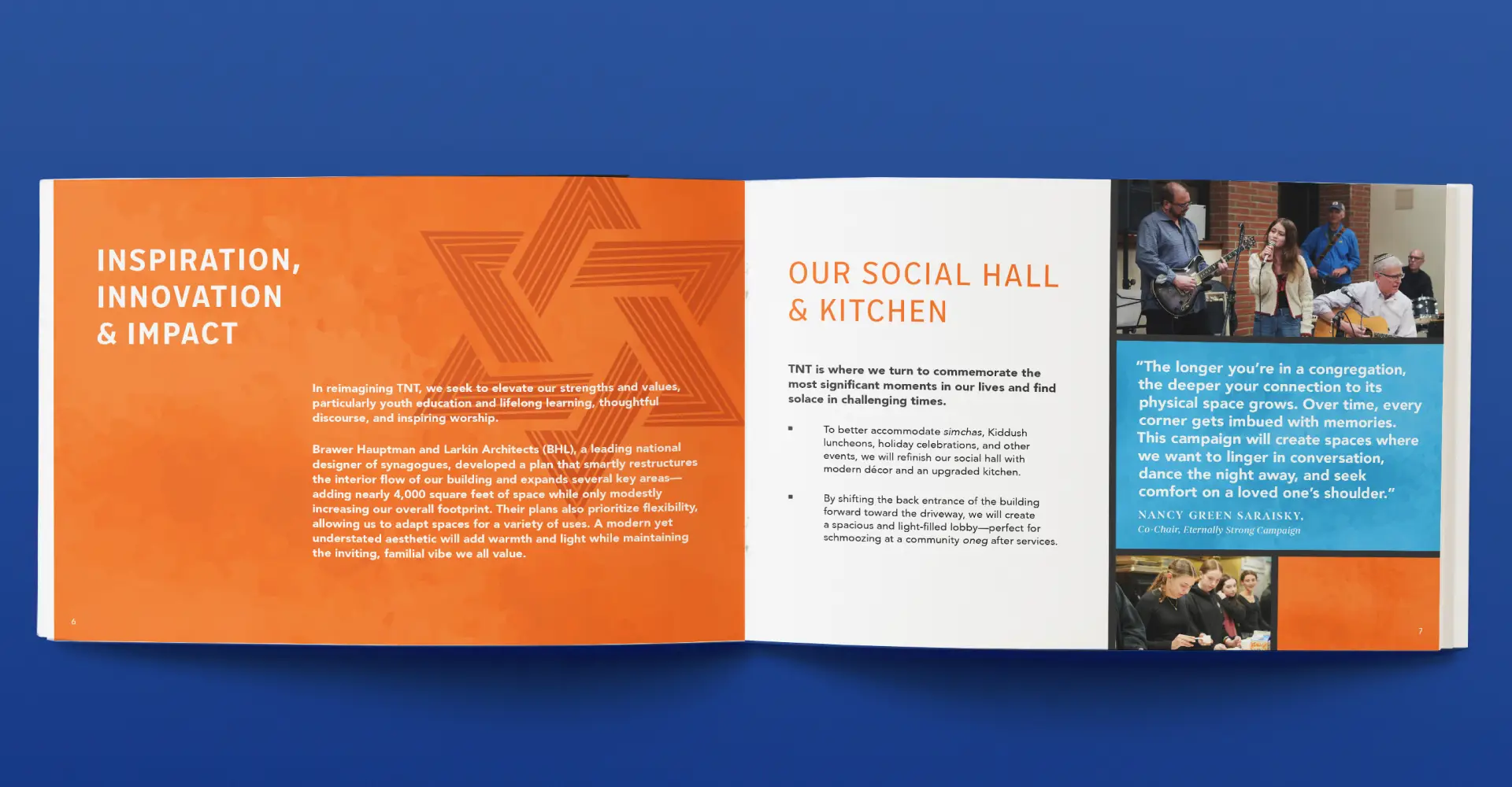
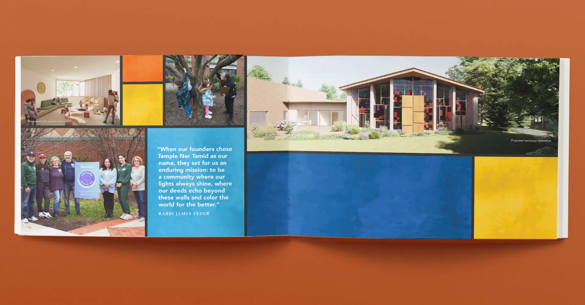
Temple Ner Tamid needed to transform its spaces into more usable, accessible, and inviting environments for the members of its community. In keeping with the inclusive feeling, they wanted the branding of their capital campaign to feel welcoming and accessible.
Temple Ner Tamid is a welcoming, diverse, and musical Reform congregation where heritage connects with the present. The new spaces will support the temple’s mission of inspiring its members to make the community more curious, connected, and just.
Carrying the Flame Forward
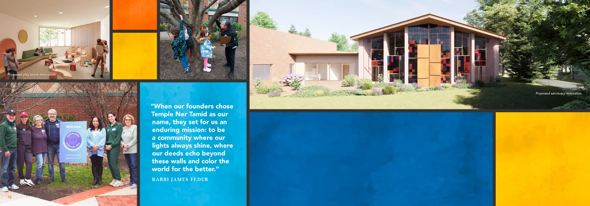
The name of the campaign, Eternally Strong, is a nod to the translation of ner tamid, Eternal Flame. The campaign logo incorporates the ner tamid, representing their legacy both past and future.
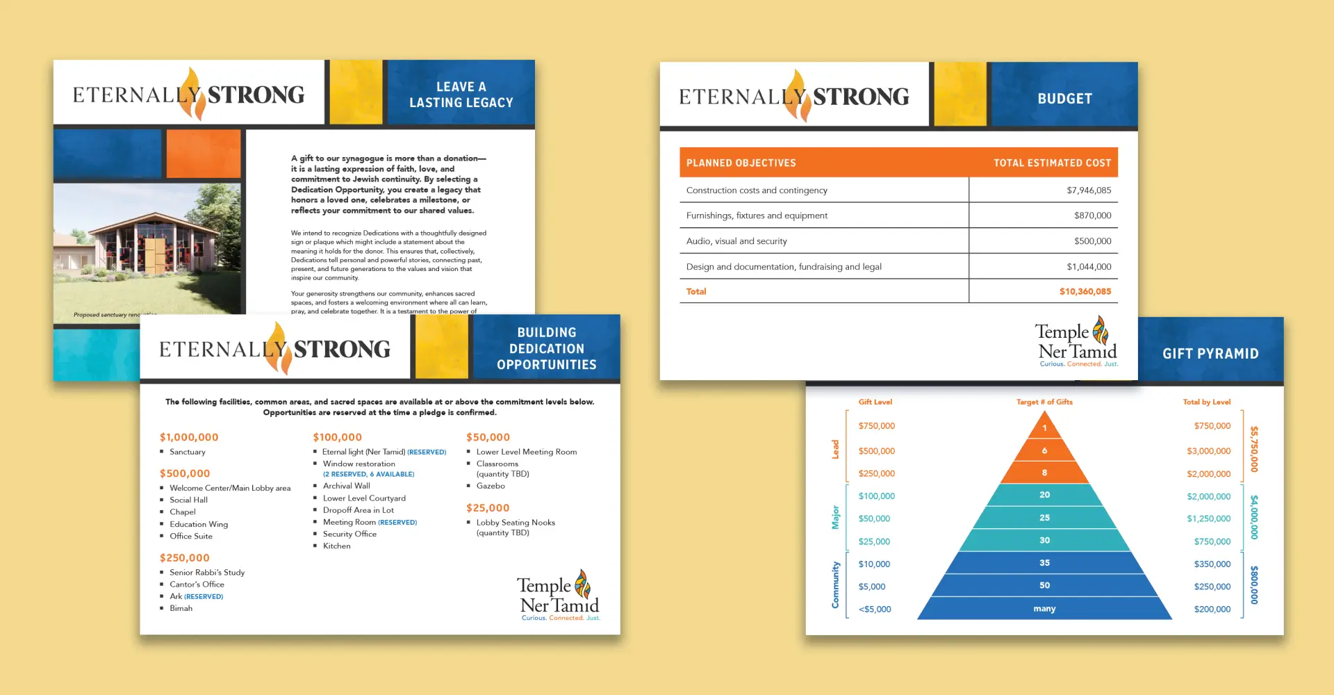
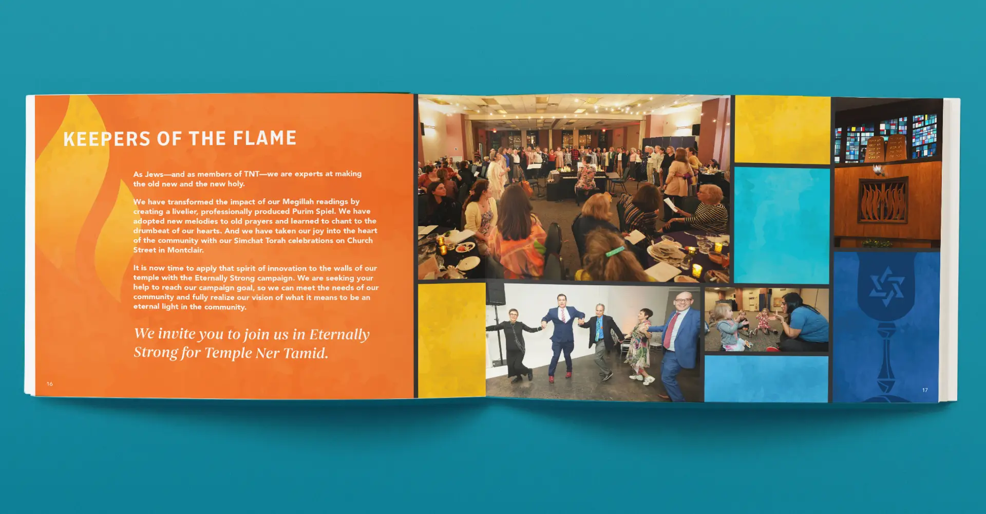
The brochure’s design elements reinforce a sense of connection and vitality. A custom pattern, inspired by the sanctuary’s stained glass, feels vibrant, warm, and personal to the temple. The pattern also serves as a flexible frame for incorporating lots of photos of their community across all ages and stages of life. The team also showcased the beautiful renderings of the planned renovations of their building’s spaces, highlighting that Temple Ner Tamid is not only a place of worship but the heart of a dynamic, multi-generational community.