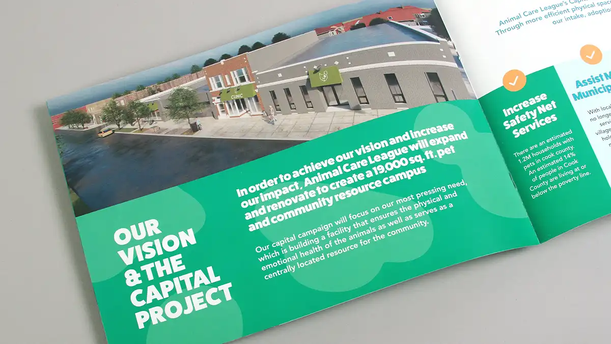
A capital campaign brochure plays an integral role in a non-profit’s efforts to raise funds. The brochure’s design and format can help share your story and present information in a way that is compelling and engaging. It’s an investment for your organization and doing it right can help your campaign succeed.
Although there are no rules around this, many capital campaign brochures follow somewhat standard sizes, hovering around 8.5″ x 11″ letter size. They are often produced in four-page increments from four to 24 pages or more. While size is usually dictated by cost, with a good bit of creative thinking and planning, even the most standard-sized brochure can be modified to incorporate interesting finishing techniques that will help it stand out in the minds of your constituents.
You are only limited by your production budget and your graphic design team’s creative imagination.
Below are some ideas that might help you decide what your capital campaign brochure format should include or consider.
What Story does the the Capital Campaign Brochure need to Tell?
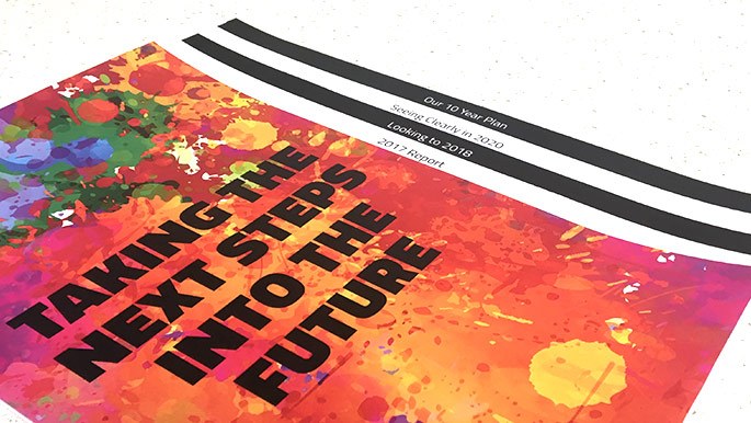
When preparing ideas and text for the capital campaign brochure, ensuring you have a compelling story to tell is critical. You need to influence those who are reading the brochure to support your cause. The story could be reflected in the format you choose. For example, a theme of “Taking the Next Steps Into the Future” might include a brochure design where the pages are progressing widths, echoing the “steps” imagery within the design.
Think about the use of headlines and subheadings in your brochure, as well as bulleted lists, infographics, photography and nicely designed charts and graphs to explain your plan for the future. These visual elements are a tool to help move your readers along the path of your storytelling and are far preferable to many paragraphs of solid text.
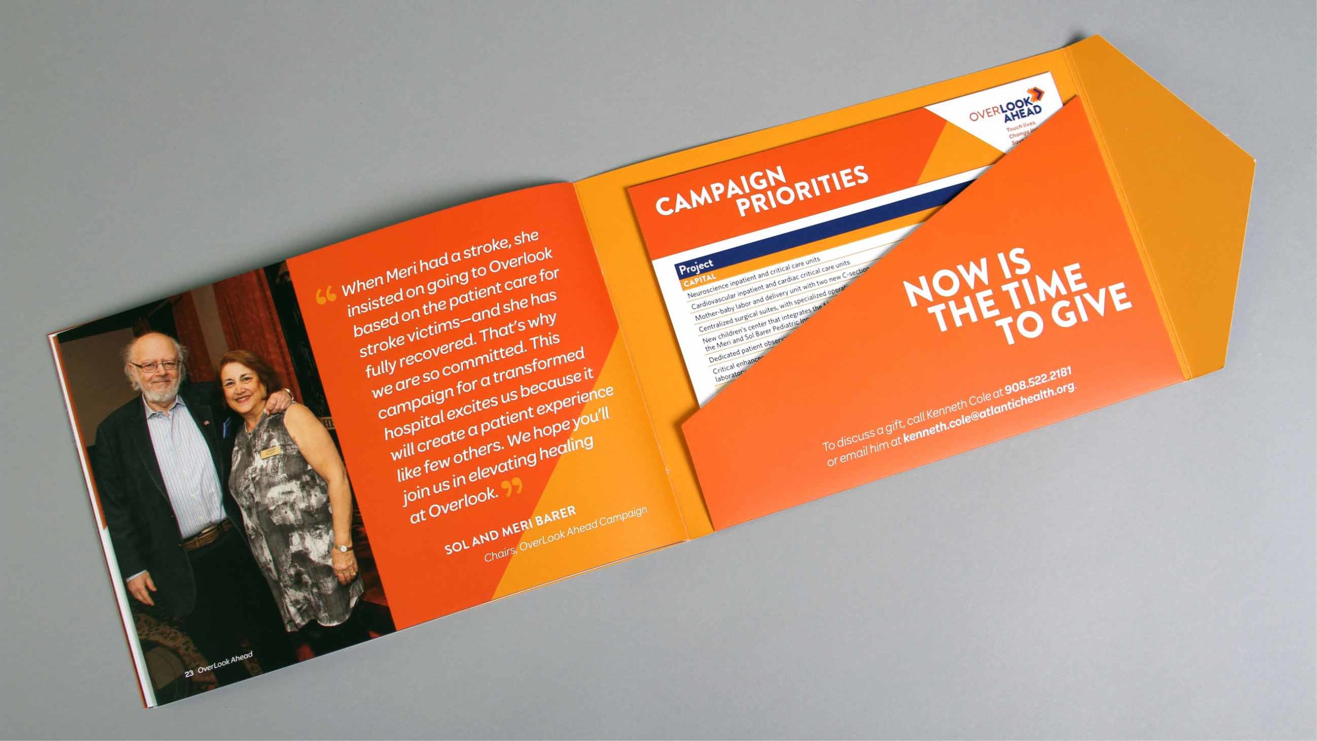
For Overlook Foundation, our team created a custom brochure design that features a pointed flap that is wrapped around itself and inserted into a die-cut slit on the cover. A pocket on the inside back cover houses customized inserts, and vellum pages help add dimension to the storytelling within the brochure. We used fonts, color palettes, and primary and secondary design elements to reflect the multi-phase expansion and enhancement project to transform the hospital.
What Types of Information Must be Presented?
When your capital campaign is in the planning stages you will identify distinct goals and outline which information should be in the brochure to help you achieve them. You must put yourself into the minds of potential supporters, then have your design team present key touchpoints in interesting ways. Here are general topics typically covered in a capital campaign brochure:
- Introduction
- About the Organization
- Current environment/challenges
- Purpose of the Campaign and the Need
- How You Can Help
- How Funds Will be Utilized
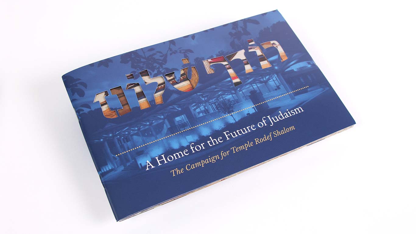
We have found that infographics and photography, coupled with smaller amounts of text, will strike the right balance of storytelling elements to inspire the reader. In our work for Temple Rodef Shalom, we used all these components effectively to educate the community about the need for their $16 million expansion project.
How Much Content Does the Brochure Need?
Several factors will come into play when determining how much content your capital campaign brochure will need:
- Who is your audience?
- How complex is your story?
- What is your budget for the campaign?
- How do you plan to distribute the brochure?
The questions above will help define some parameters for the volume of content you will need. If the budget is relatively small, you may have to keep things simple, which would mean keeping your story short. Shorter text means less design time, less paper, and potentially less postage to distribute the campaign brochure.
Early on in the process, before we begin designing a capital campaign brochure, Trillion likes to work with our clients on a pagination plan. It’s a simple tool that helps create an outline of the types of content that will be on the pages. The photo below shows a pagination plan for a 16-page brochure. The pagination plan lets you loosely visualize space allocation for things like the cover, a mail panel, table of contents, charts, financials, stories, photos and other sections that may be needed.
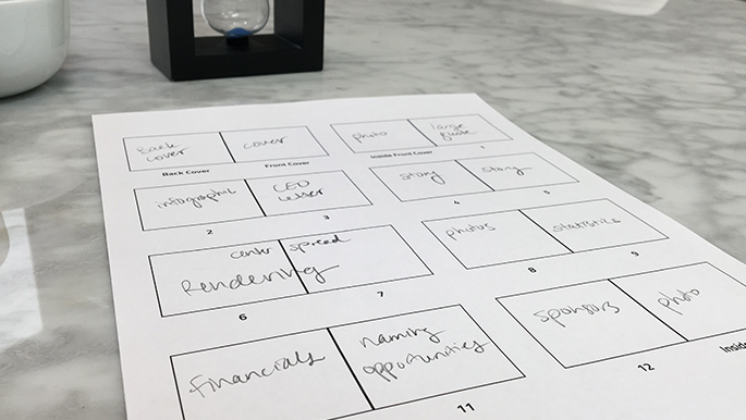
Once your pagination plan is developed, your designer can help determine a comfortable word count for each page. Working to fit text content into a design can save time when writing because you, or your copywriter, will have defined parameters to work within, reducing layout revisions.
Will You be Mailing Your Capital Campaign Brochure?
Most likely your brochure will be distributed in numerous ways. Your most important supporters should be courted and presented with the brochure in person. But how will everyone else receive it? A self-mailer (a direct mail piece that includes addressee and postage info on the outside and does not need an envelope) will save on envelope printing costs as well as insertion time/costs. However, a self-mailer might need one or more wafer seals so it doesn’t become damaged through the postal delivery process.
For a capital campaign brochure mailing, Trillion prefers to have the brochure inserted into an outer envelope. This process protects the integrity of the brochure and also provides a way to include a cover letter or other support materials in the mailing. Also, remember to ask the team mailing your brochure about non-profit rate postage. You could save significant money if you plan ahead for the extended delivery time of non-profit rate postage.
What is Your Capital Campaign Brochure Budget?
Leveraging your dollars is key to creating something special. Our experience has shown that when you invest in creating a compelling visual story, with an interesting delivery method, the heightened attention results in more funds being raised.
We find it easier to use the budget as the driving force in creating parameters for a capital campaign brochure design. We can adjust content, sizes, page quantity and delivery methods to help us take advantage of higher cost, and special finishing techniques such as die cuts, foil stamping, embossing, special papers and more. These techniques can elevate your capital campaign brochure from the norm.
Other Materials for Your Campaign
With a beautifully completed brochure, your campaign is off to a great start! Now that you have a winning design and a clearly thought out story, those building blocks will help you create the rest of the materials you need: a short campaign video explainer, a fundraising team presentation, digital component to record success, and possibly signage and swag. These can echo the style of the brochure to use the momentum your have created. Done well, the materials will elevate your overall marketing and donor communications efforts.
A Successful Capital Campaign Tool
A capital campaign brochure needs a design that beautifully integrates information with an appealing story. Your graphic design team should be asking lots of questions and requesting additional information when creating the brochure. At Trillion, we ask detailed questions so we can better position our clients’ brochures to stand out and grab the attention of their audiences.
If you need help positioning your capital campaign brochure for success, give us a call at 908.219.4703 or complete our contact form and we will reply promptly.


