Homepage Design for Financial Services Firm
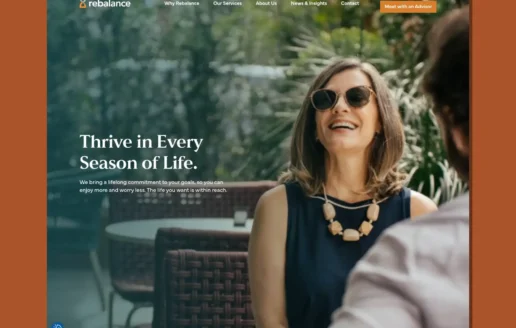
The Challenge: A Brand Built for High-Net-Worth ClientsAfter rapid growth, a lower-cost investment advisor had evolved into a wealth management practice and needed a digital presence that signaled security, expertise, and elevated status to an affluent audience.Rebalance had grown from a lower-cost investment advisor into a wealth management practice serving individuals with $1M or more in assets.A Website Designed to Cultivate TrustTrillion designed a brand-new website that expressed an established, trustworthy, and elevated identity. Trillion introduced a richer, earthier color palette, refined typography, and tactile textures, rewrote all content to lead with client benefits, and created bespoke illustrations and artwork. Trillion also streamlined navigation, optimized for mobile, and emphasized the firm's deep bench of expert financial advisors.
Rebalance Website DesignBranding, Website
The front cover of the menu for MGM Music Hall on a blurry background.
Designing a Catering Menu That Matches the Atmosphere of Live EventsA newly opened venue needed a catering menu that would elevate the guest food and beverage experience and reflect the energy of concerts and live shows. The challenge was to align the menu with a family of existing catering and suites menus while giving it its own distinctive identity.MGM Music Hall at Fenway is an event and entertainment venue located on the grounds of a historic ballpark.Catering Menu Design and Digital DeliveryWorking with the venue's in-house food and beverage service provider, Trillion defined the look of the catering menu using the established venue brand. The design is darker to emulate the atmosphere of concerts and live shows, pairing elegant typography with exciting concert photography supplied by the venue.The finished menu was also added to the FlipSnack platform so it can be easily shared with clients as a flippable online experience with embedded links for ordering.
The cover of the Camp Avoda Case for Support brochure
Building the Next Century of Brotherhood at Camp Avoda As it approached its centennial, Camp Avoda needed to expand and modernize aging infrastructure to meet rising enrollment and the expectations of today’s campers and families, while securing the funding needed to sustain future growth. Camp Avoda, a Jewish summer camp for boys in Massachusetts, has spent a century cultivating strong Jewish identity, leadership, and lifelong brotherhood. The Camp Avoda 100 Campaign rallied support around this vision. Bringing Mission to Life Through Story and Design Trillion’s case for support design intentionally blends storytelling and concrete impact, with copy that evokes heritage and continuity and includes narratives of personal transformation and alumni connection. This establishes an emotional foundation and reinforces the mission before introducing data points such as scholarship reach, enrollment growth, and community impact, which build credibility. The design organizes complex information into clear, digestible sections, including charts, maps, and renderings, allowing potential donors to easily understand both the “why” and the “how” of the campaign. The brand elements feature both handmade and perfect circles working together to showcase the fun that camp brings and the esteem of the organization.
The Tech Interactive end of year appeal front cover design.
Reaching Four Donor Segments With One Year-End AppealFor its end-of-year appeal, the museum needed to engage four distinct audiences, current donors, lapsed donors, members, and lapsed members, and distill the full scope of its impact into letters that would resonate with each. It also wanted to carry through some of its previous branding tied to 'Wicked: For Good.'The Tech Interactive is a family-friendly science and technology center in San Jose, California, with a mission to empower the next generation of problem-solvers through inclusive STEAM education.Segmented Appeal Letters and Flyer DesignTrillion developed four tailored letters, each with a colorful sidebar of statistics and copy for its segment, paired with a two-sided flyer of easy-to-scan statistics and emotive photography of children in museum programs. Brief, compelling blurbs highlighted current exhibits and measurable impact, subtle 'Wicked: For Good' cues ran throughout, and a QR code on the flyer and letter made giving easy.ResultsThe appeal performed extremely well, raising $50,000 more than the previous year and securing a large leadership gift from a brand-new donor.
A homepage design showing an image of NY Penn Station's busy interior.
Organizing a Wealth of Content Into an Intuitive Digital ExperienceThe firm needed a website that could house a wealth of information while making it easy for clients to find the right attorney, service, or resource. The challenge was meticulous planning and taxonomy, connecting attorney bios, practice areas, and articles so related content surfaced naturally across the site.Kaufman Borgeest & Ryan is a national law firm with nine offices and more than 130 lawyers serving clients nationally and internationally.Website Design, Taxonomy, and DevelopmentTrillion designed and built a website with a carefully planned taxonomy so that an attorney bio links to the articles they have written and their practice areas of expertise, making relevant information and lawyers easy to find across several factors.Features included unique mobile and desktop experiences, over 130 detailed attorney profiles with dynamic connections to other pages, vast practice area and practice group integration, and custom micro-animations and parallaxing. Homepage video, photography, carefully written content, and a strong brand presence made the finished site impressive, effective, and relevant. The project earned a Web Excellence Award.